Tableau Project
Correlation between ages in Titanic
Correlation between ages in of people in Titanic
Data source comes from Kaggle projects.
Link:
https://prod-useast-b.online.tableau.com/t/franciscoguardado/views/Demonstration1/Dashboard1
Analysis and Representation:
To visualize the correlation between age and passenger class, I create an intuitive scatter plot in Tableau. Each point on the plot represents an individual passenger, with the x-axis representing age and the y-axis denoting passenger class. Different colors distinguish between the three passenger classes, creating a visually appealing representation of the data.
Insights and Implications:
As I scrutinize the scatter plot, intriguing patterns start to emerge. It becomes evident that the majority of first-class passengers tend to be older, reflecting the likelihood of wealthier individuals affording premium accommodations. Conversely, the scatter plot reveals a broader age distribution among second and third-class passengers, hinting at a more diverse socio-economic background.
Conclusion:
By leveraging Kaggle's data resources and Tableau's visualization capabilities, Mark successfully uncovers a compelling correlation between age and passenger class distribution among Titanic passengers. This newfound knowledge not only adds depth to the historical narrative but also highlights the importance of data-driven insights in unraveling complex patterns within large datasets.
Viz link:
<script type='module' src='https://prod-useast-b.online.tableau.com/javascripts/api/tableau.embedding.3.latest.min.js'></script><tableau-viz id='tableau-viz' src='https://prod-useast-b.online.tableau.com/t/franciscoguardado/views/Demonstration1/Dashboard1' width='1430' height='867' toolbar='bottom' ></tableau-viz>
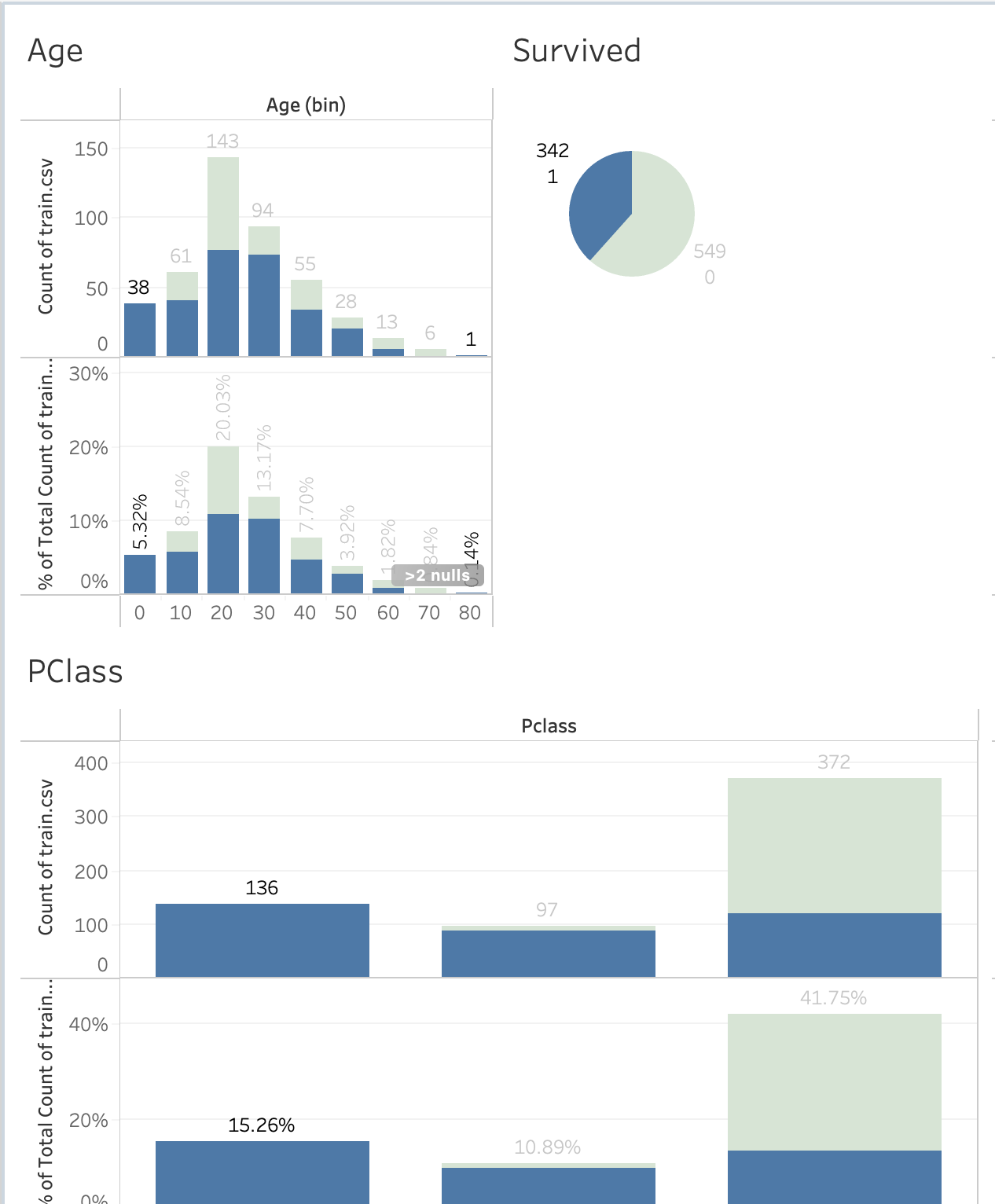
Dashboard:
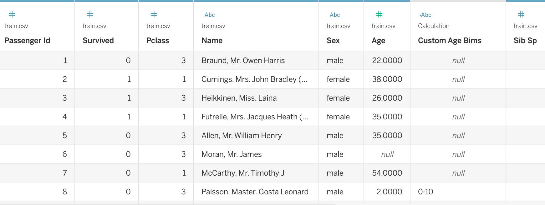
Data Sourcer
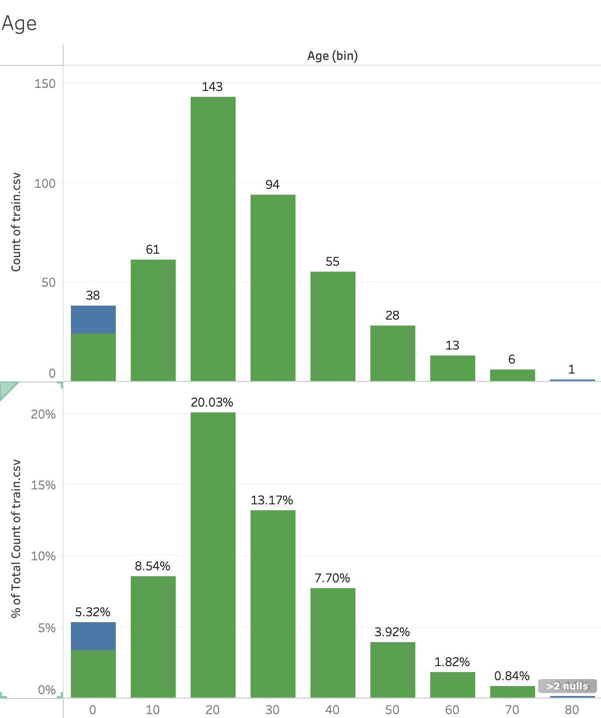
Age Sheet:
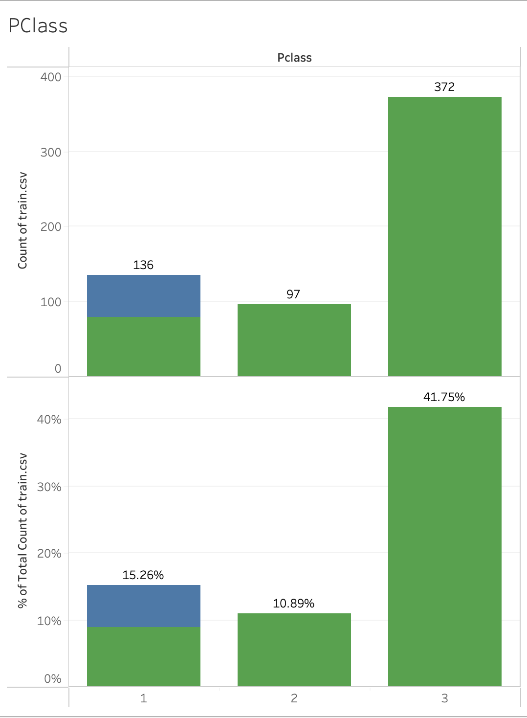
PClass/Passanger Class:
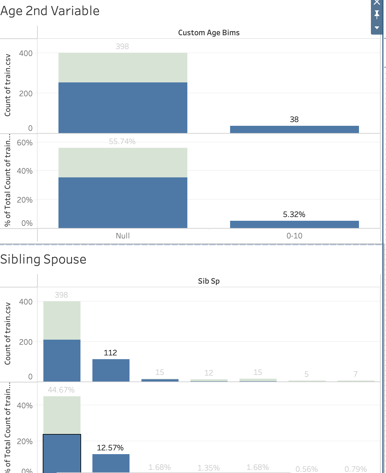
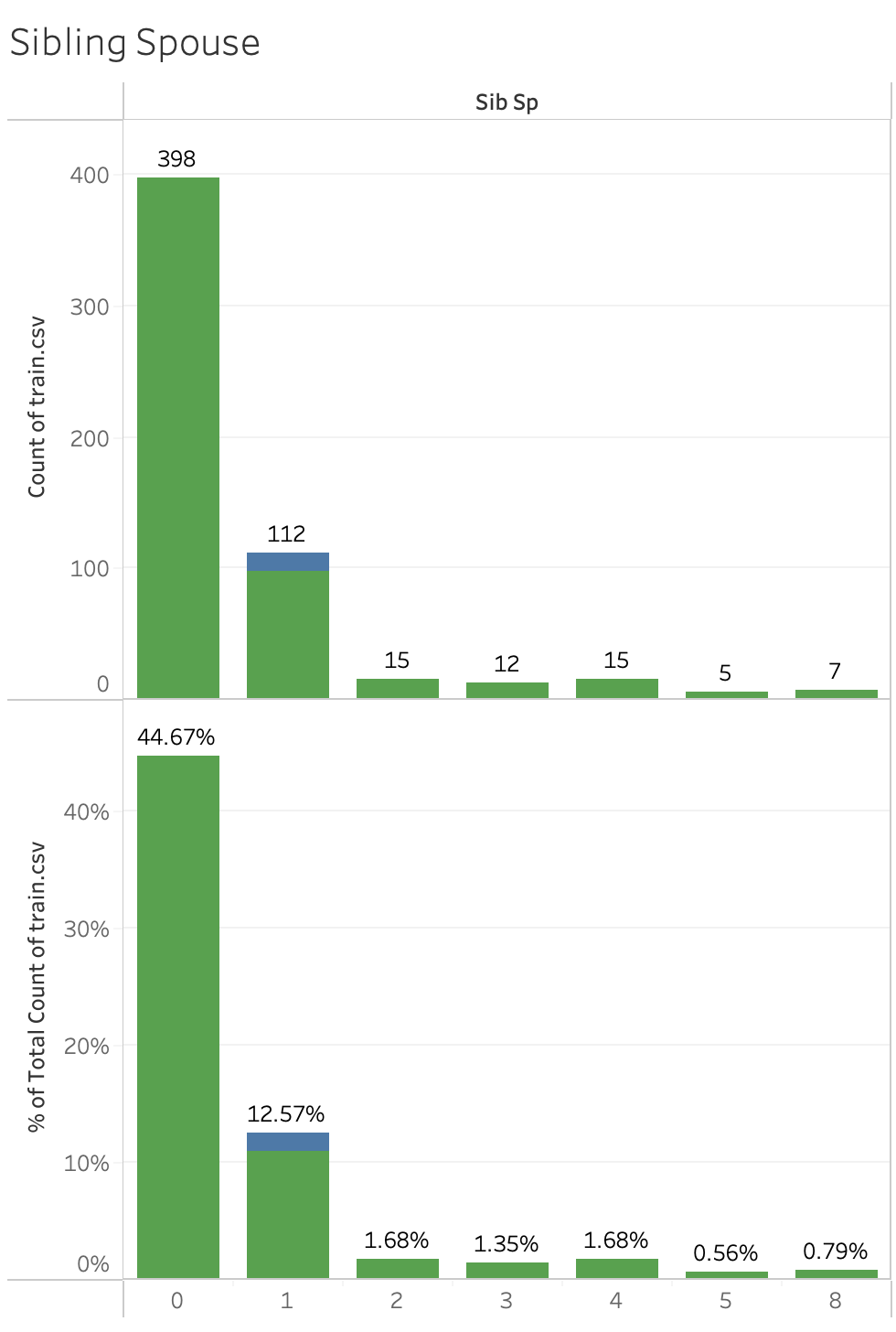
Sibling:
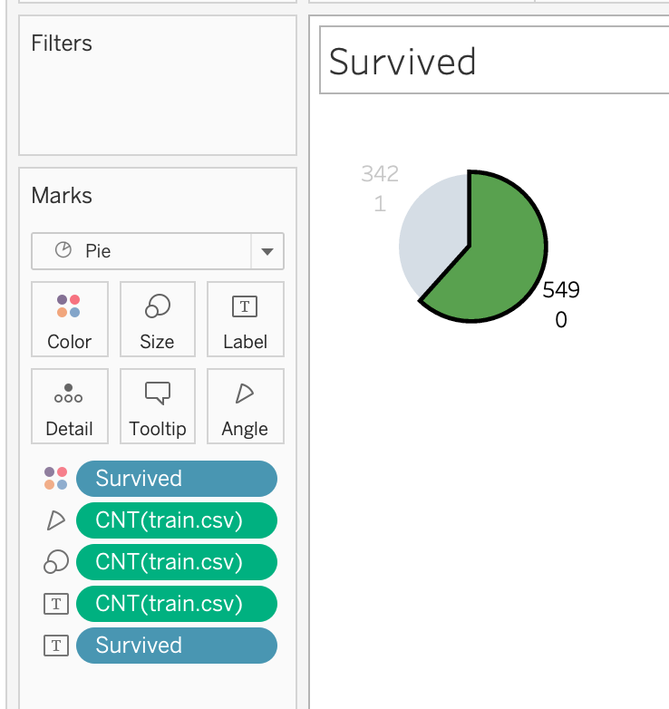
Survived:
