WordPress - React - Gutenberg Block
Gutenberg Block
This is a Gutenberg Block - Custom plugin which you can create dynamic sections similar to sections created by the Divi theme. You can add images, add content, and interact with the forms of these sections.
GitHub Link:
https://github.com/franciscojavierguardado101/Gutenberg-React
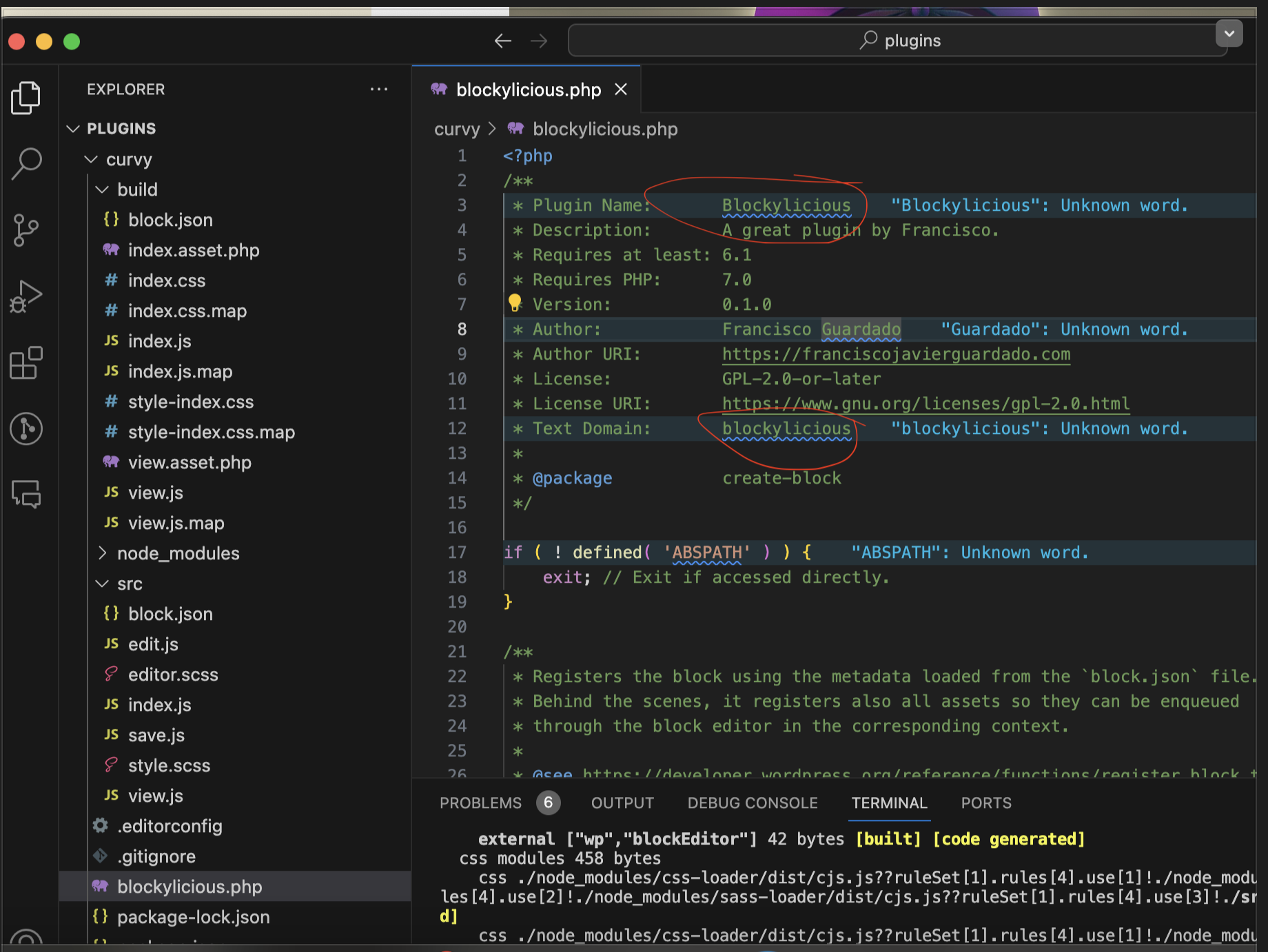
Then do on Terminal:
Control + C then run the command: NPM START
This will update our site changes
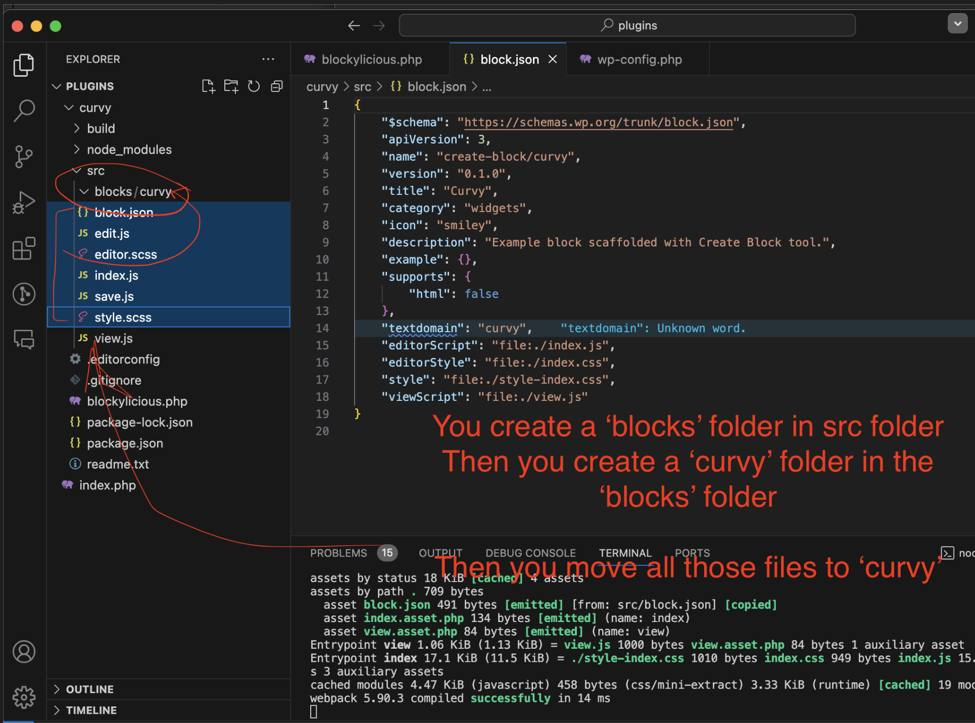
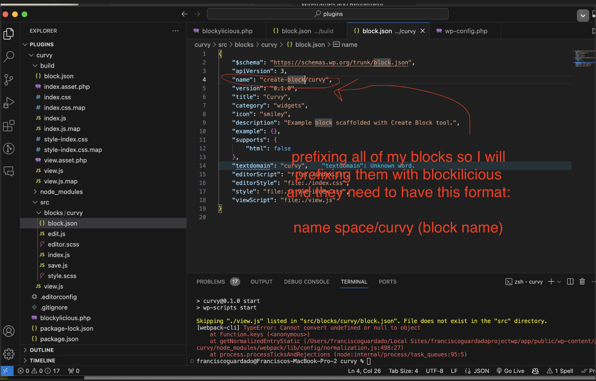
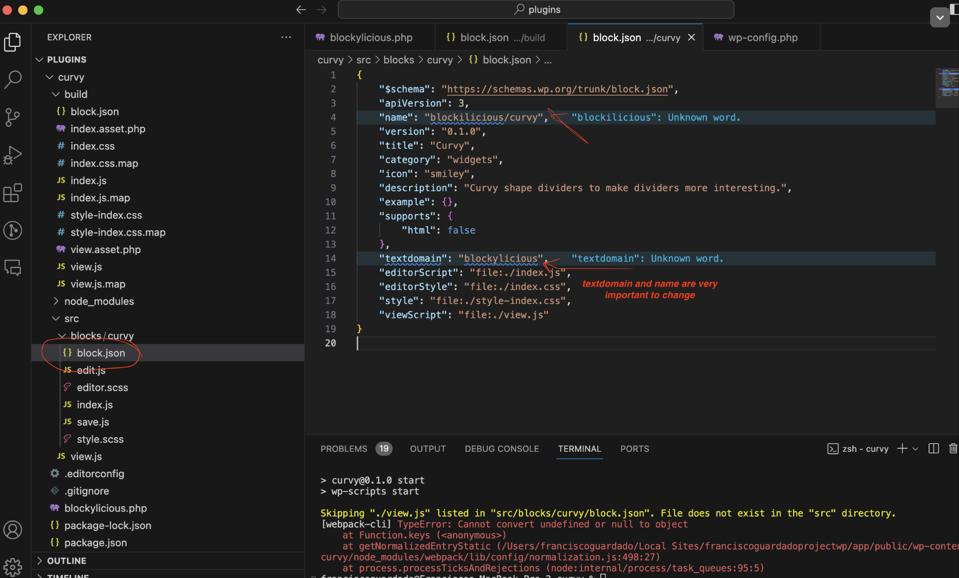
Using and referencing the correct class name is important
Check on
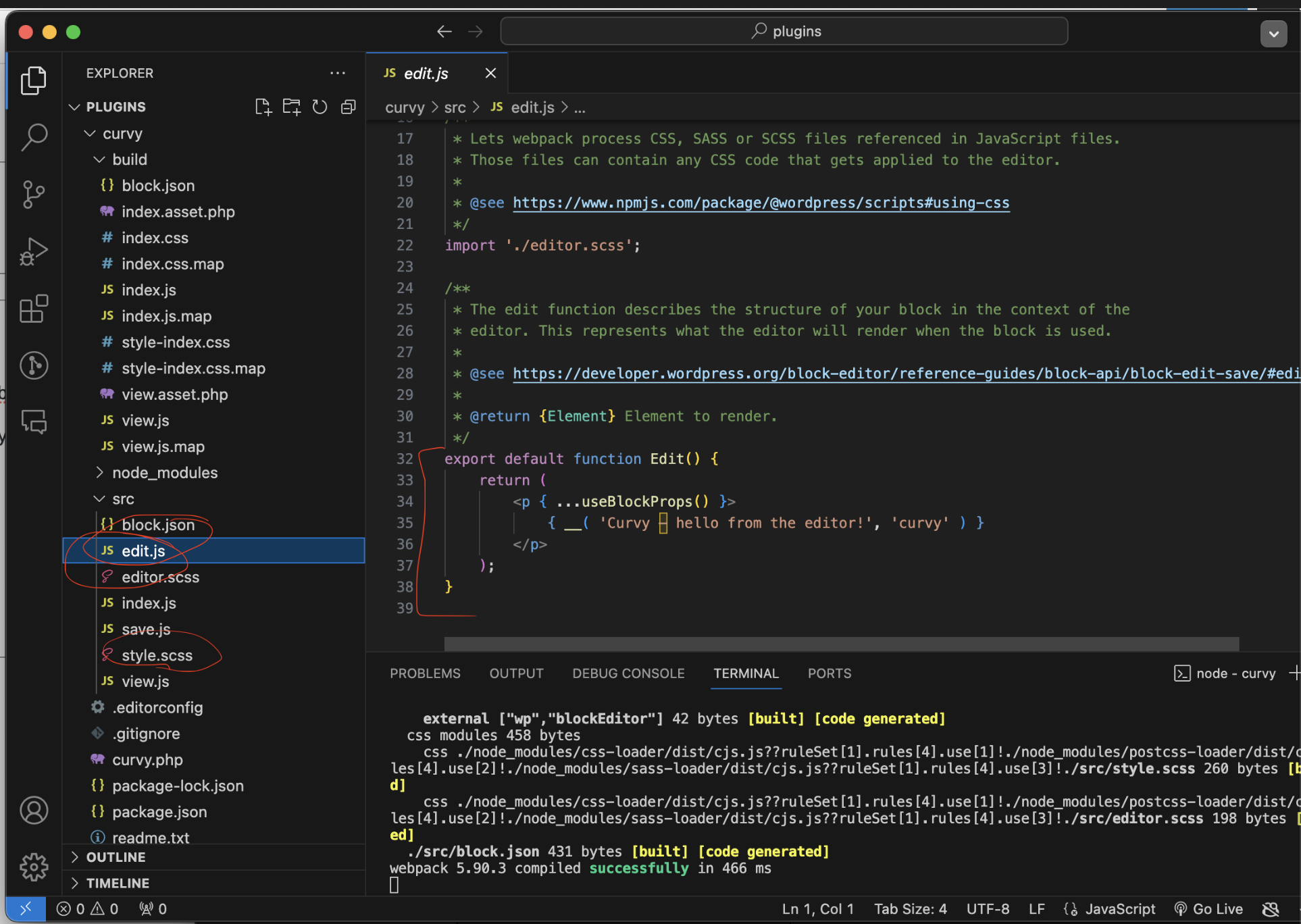
style.scss
Editor.scss
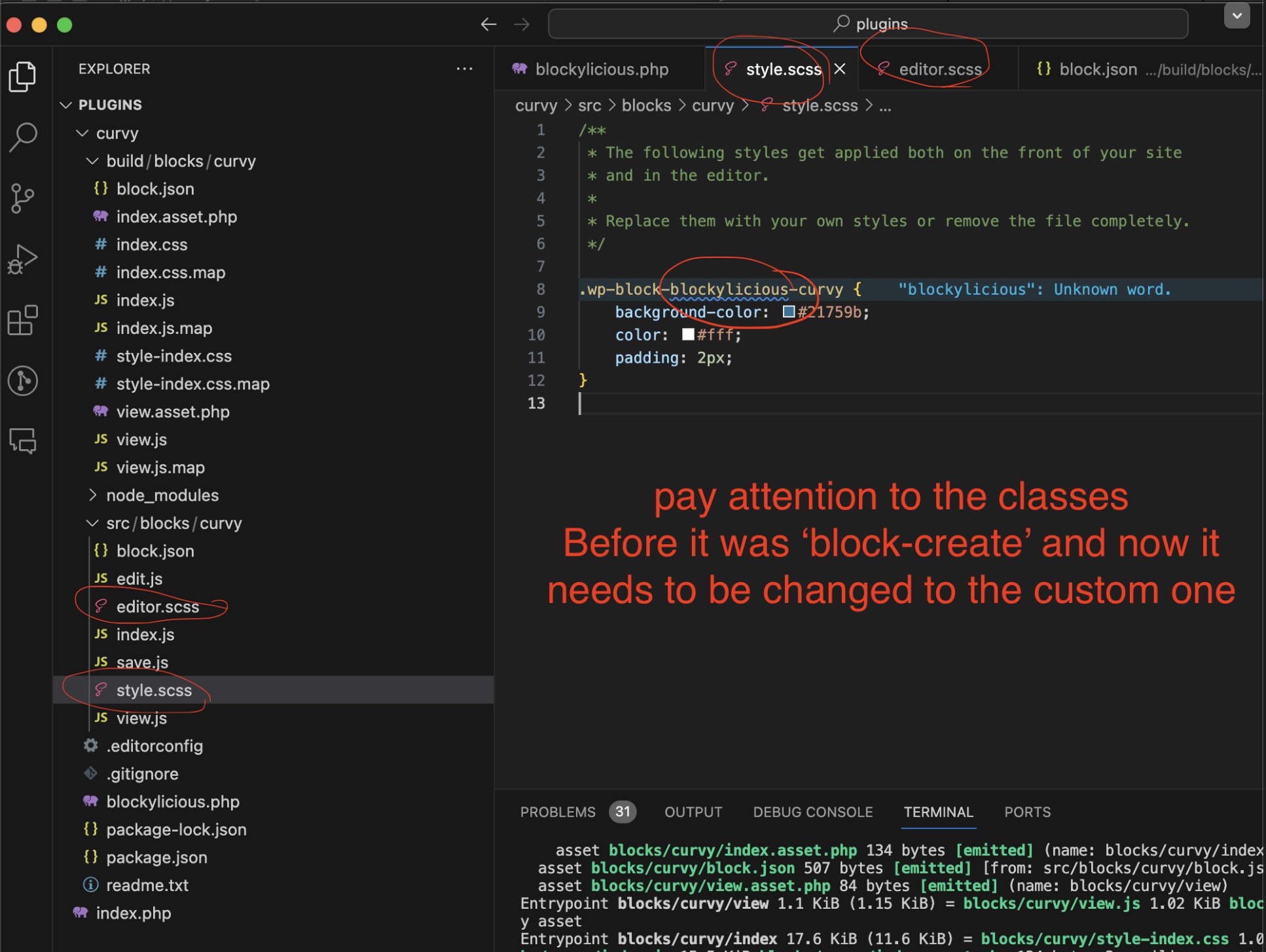
Go to SRC/BLOCKS /CURVY/ EDIT.JS
There we are working with React components. Edit is a react component
We always have to return mockups with a common single parent element
It’s best to use a ‘React fragment’ as a placeholder and there will not be html associated with it. = A container
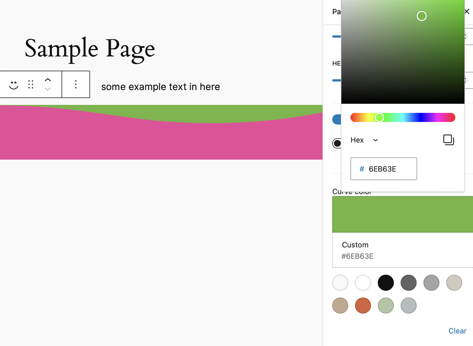
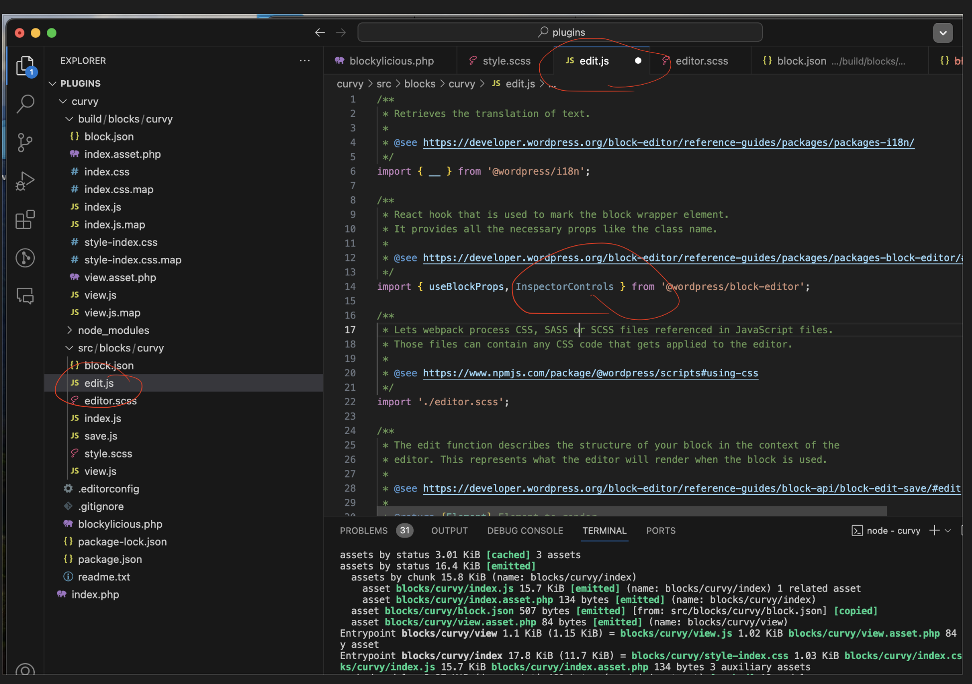
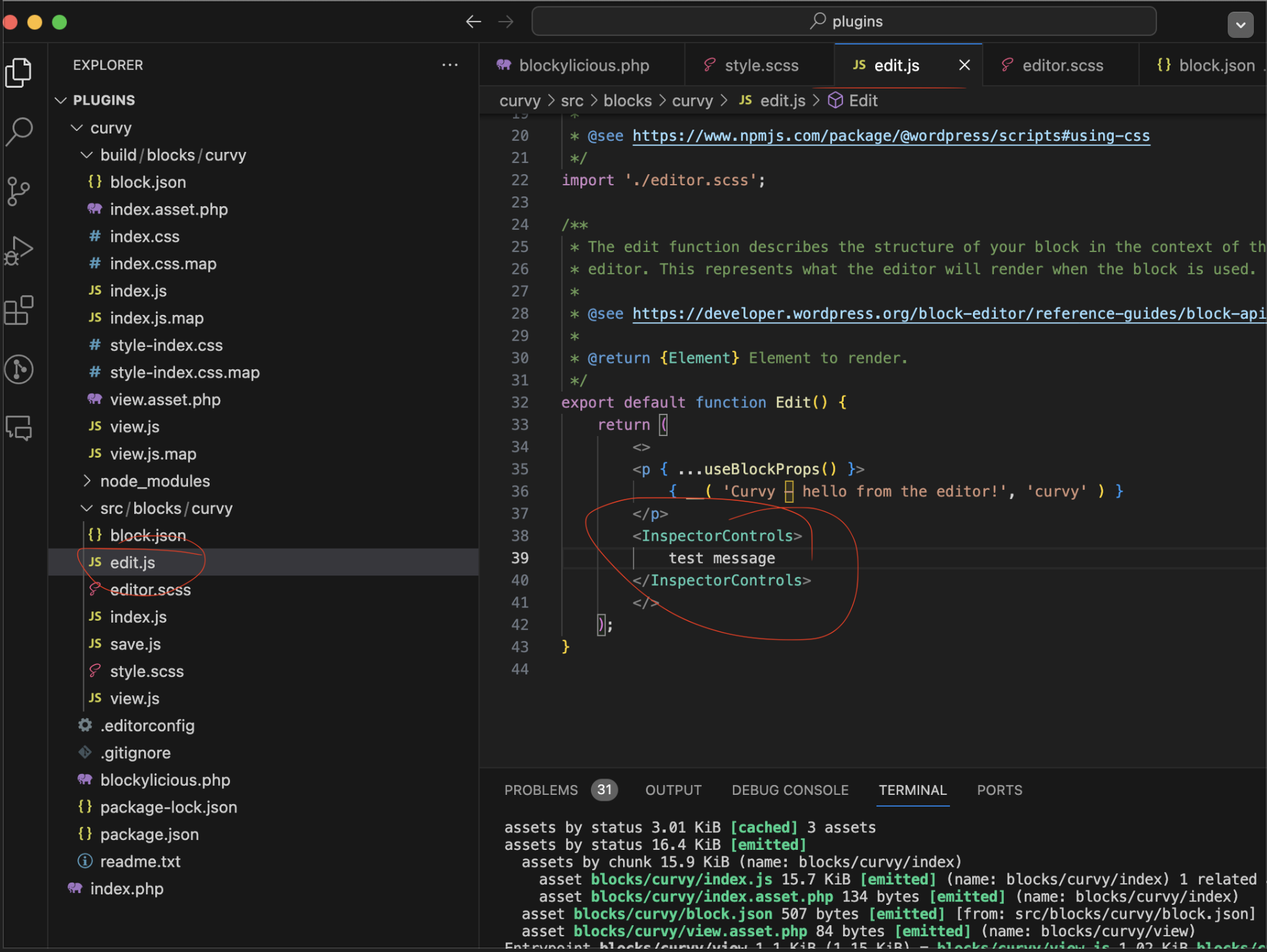
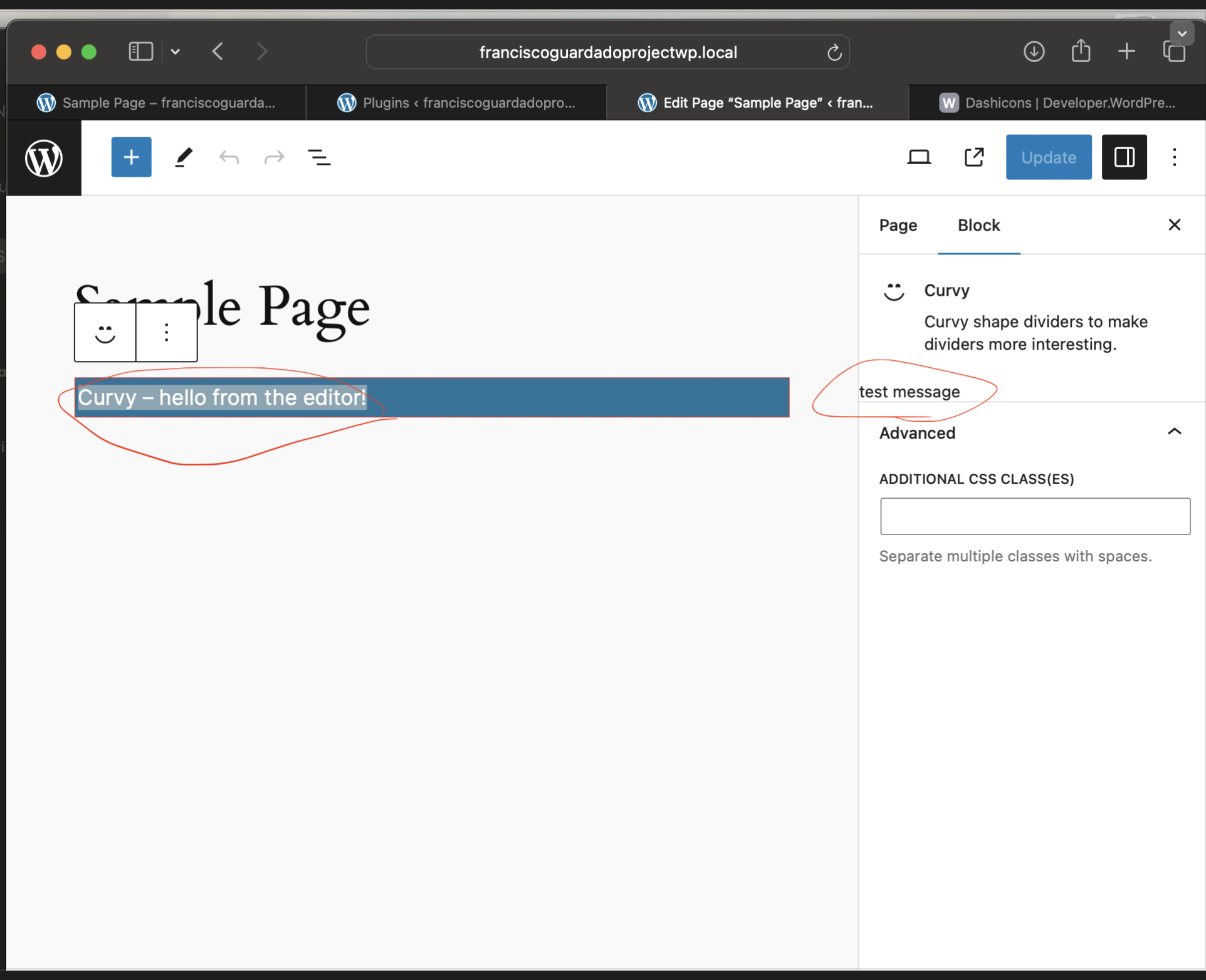
Note: Following images and content will be for building up the settings for my block
Building:
===================================================
Note:
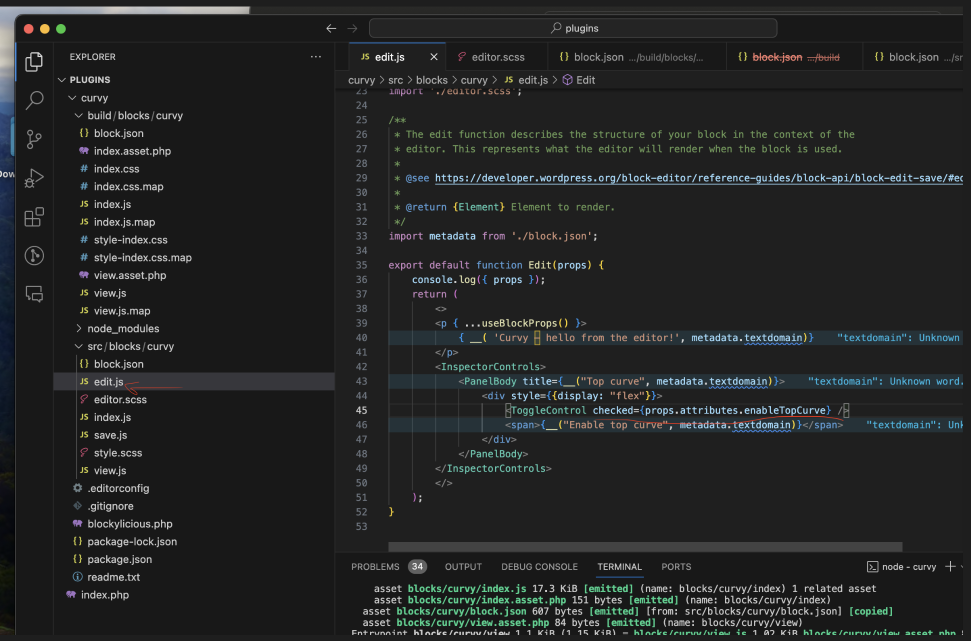
WordPress provides us with the React components to style our blocks and look design that would help to have everything matching with the branding using components such as PanelBody
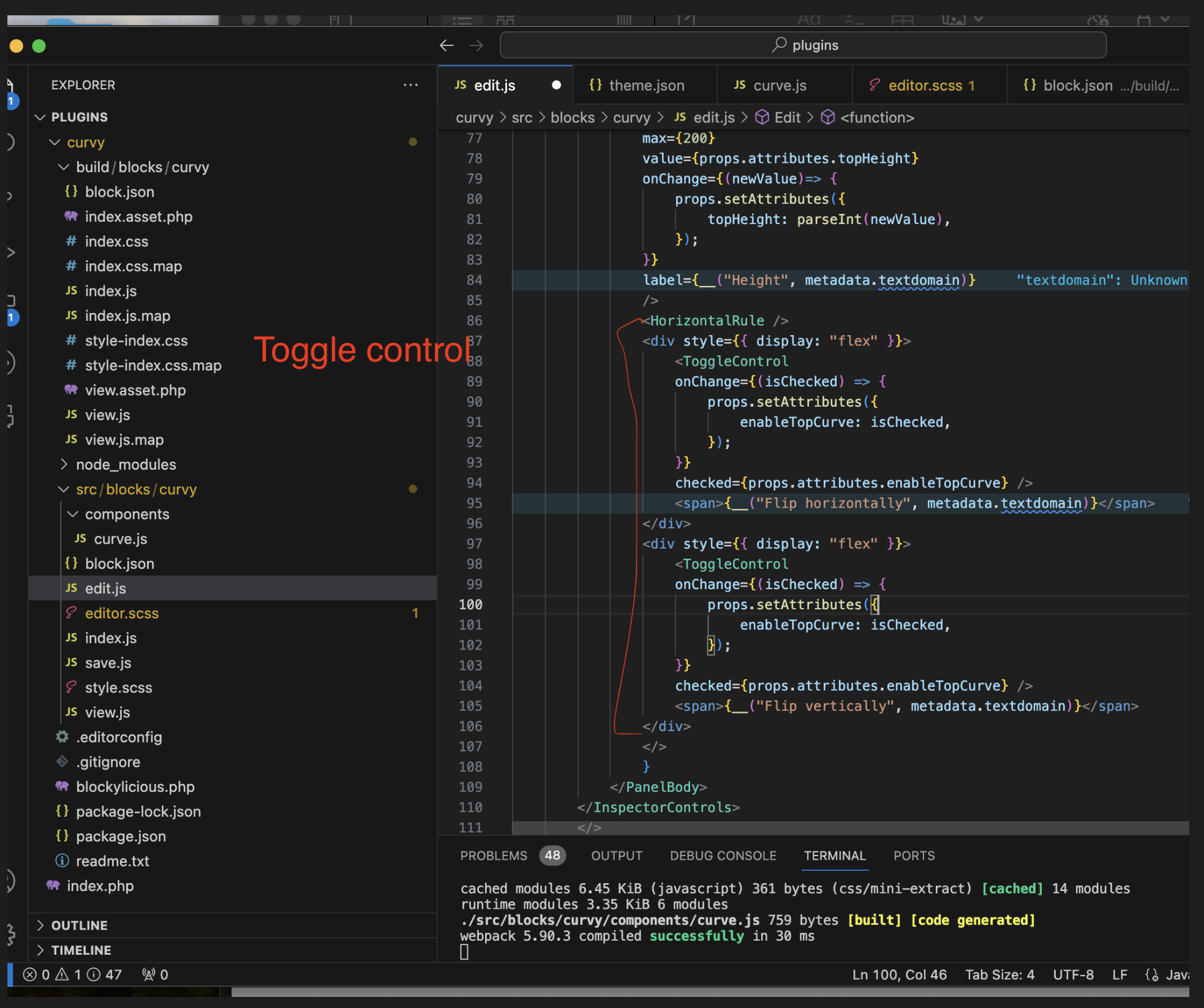
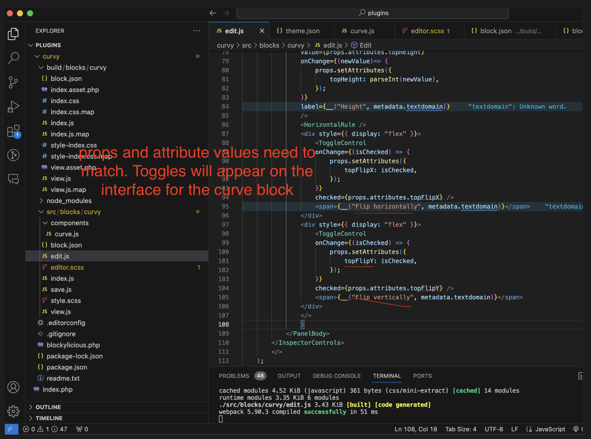
We can also use the toggle component
We need to use React in order to interact with the toggle component in order to make the function work
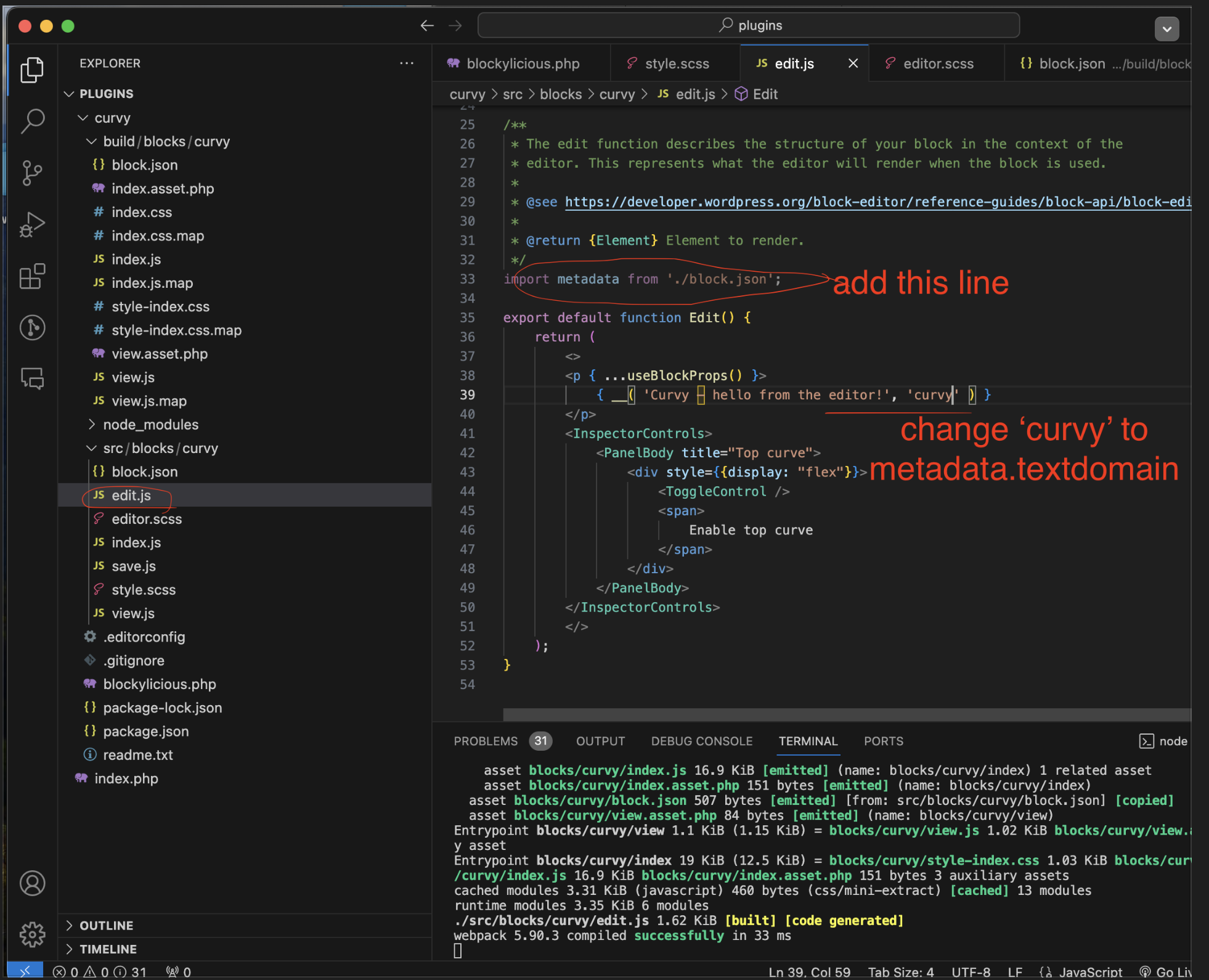
Note:
The less hard code the better
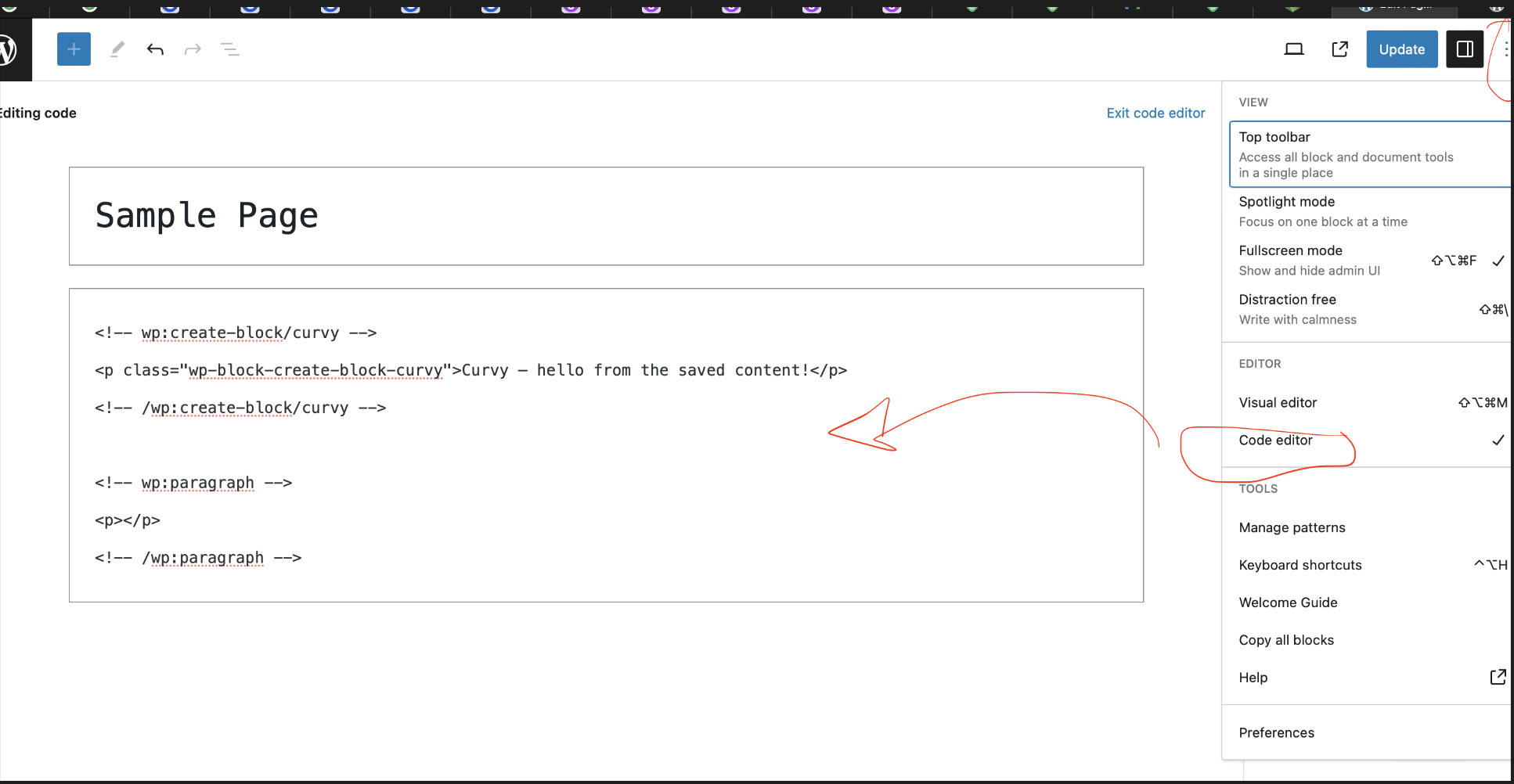
Go to WP interface
Above our curvy block create a new one with some text such as ‘Some example text in here’
Then align it to the center
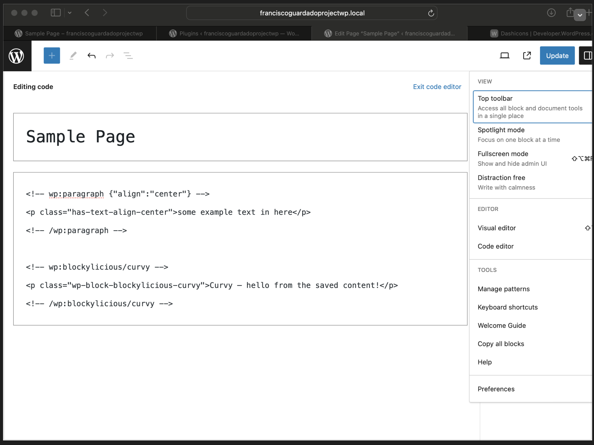
Then upper right side corner click on ‘Code Editor’
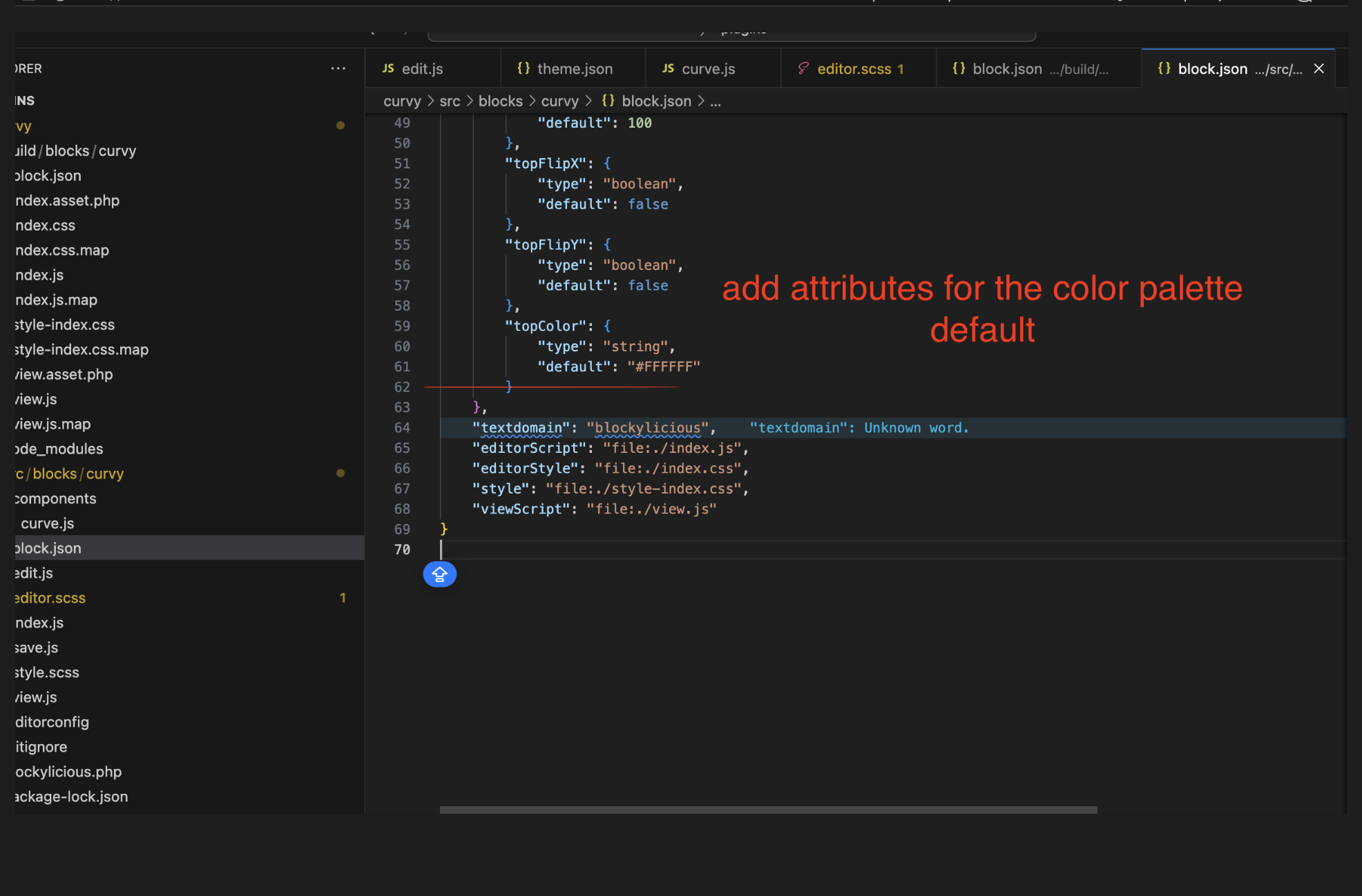
WordPress will give us a snippet of code and we are going to use those attributes within our block
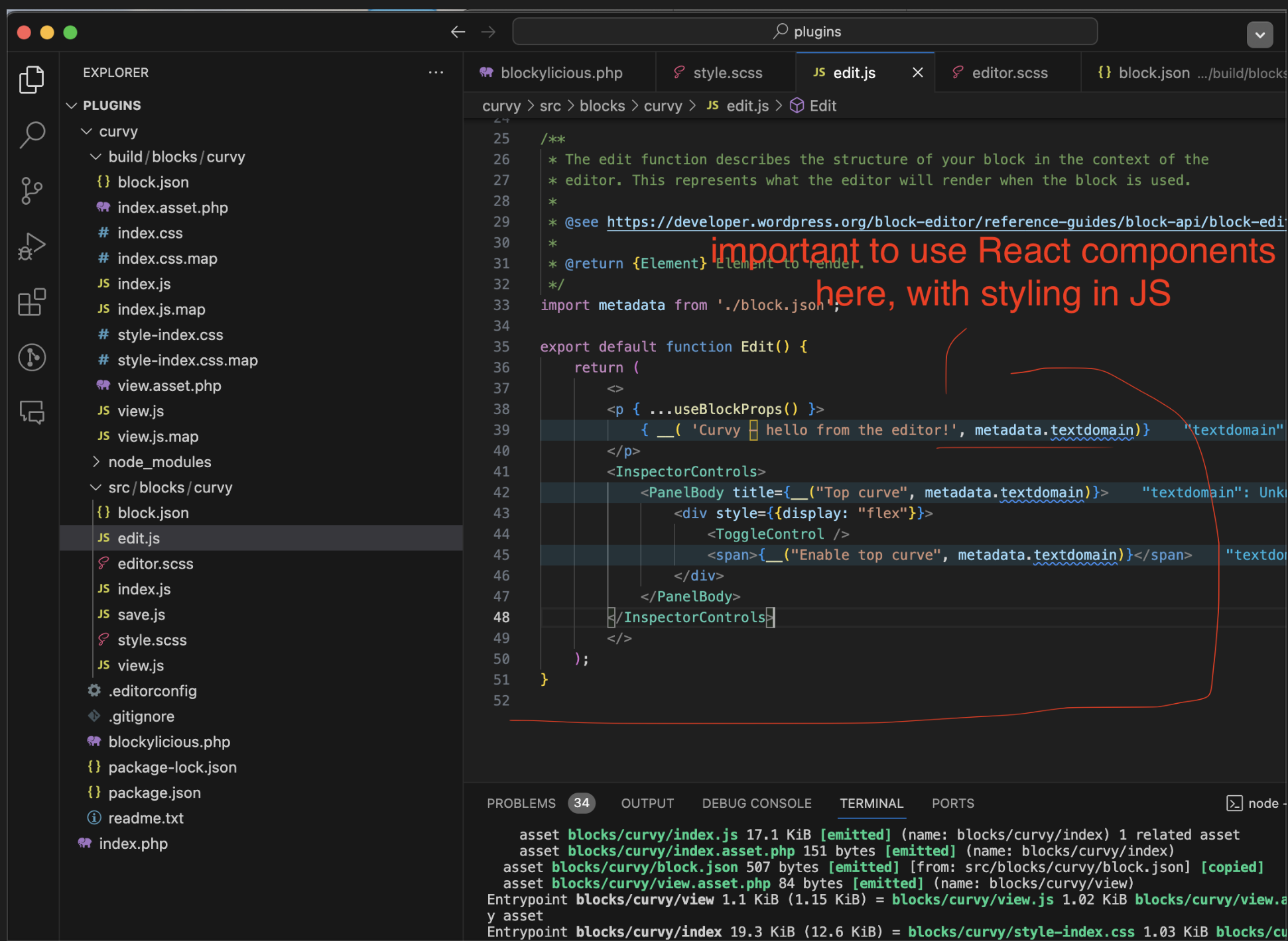
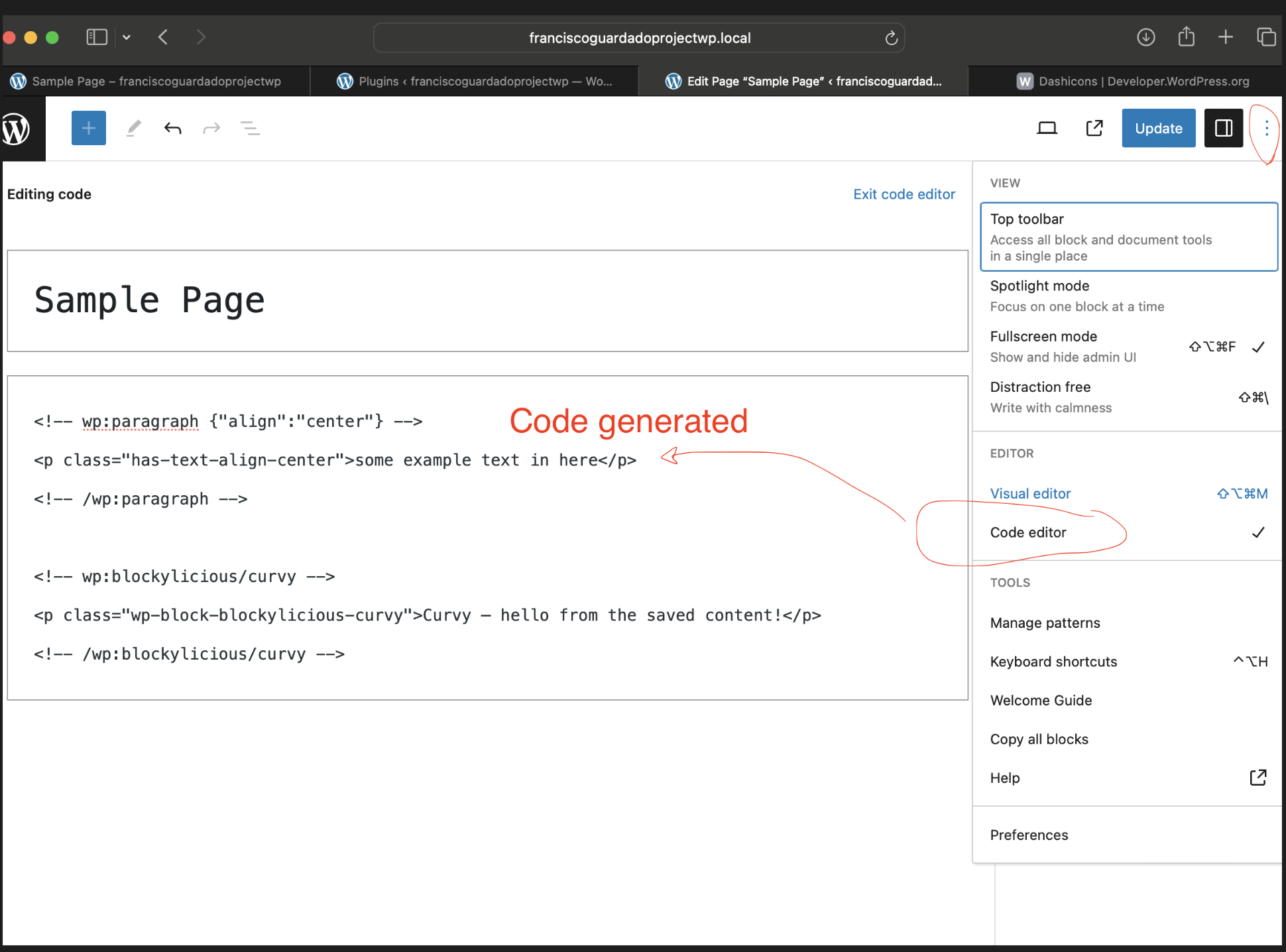
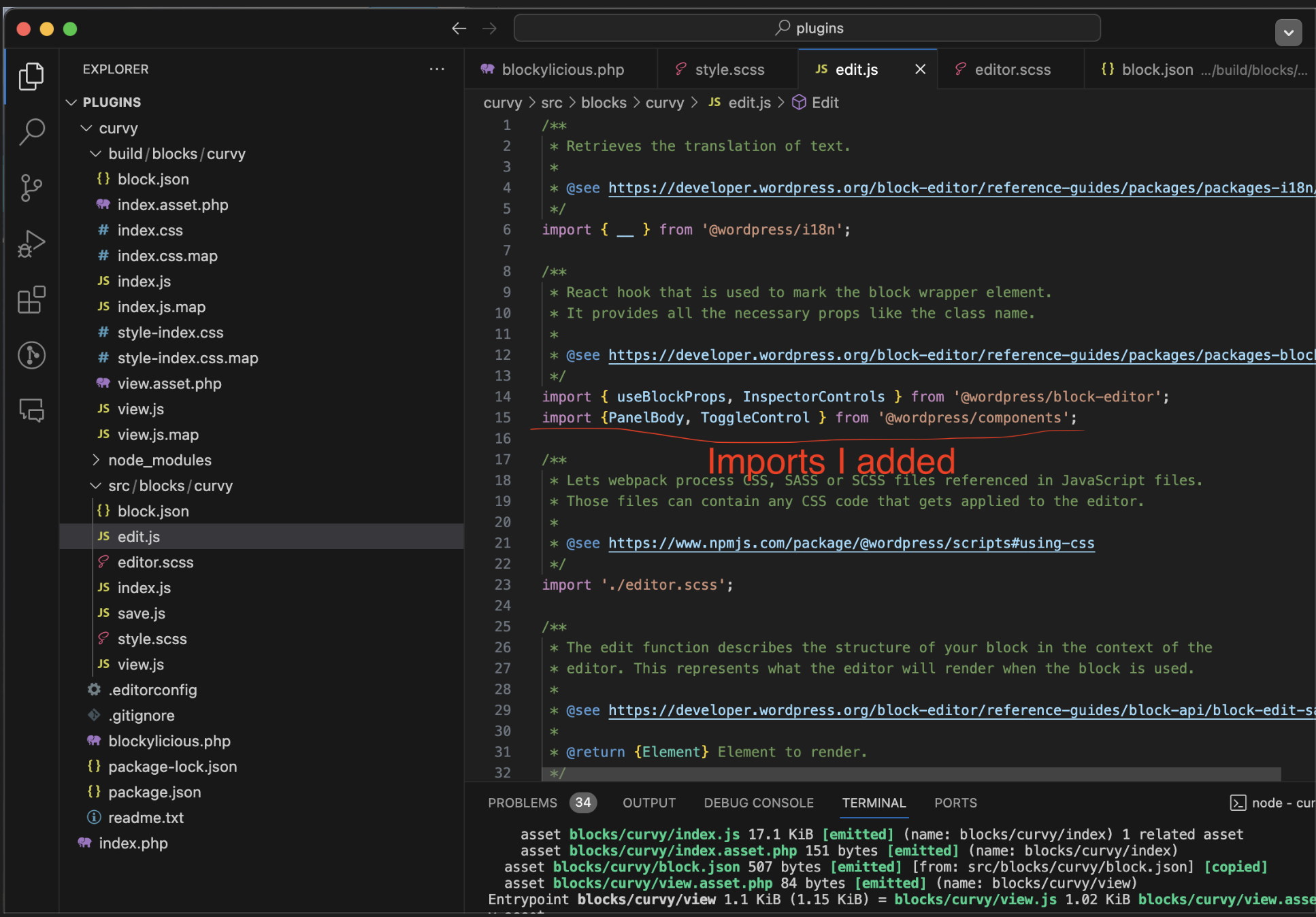
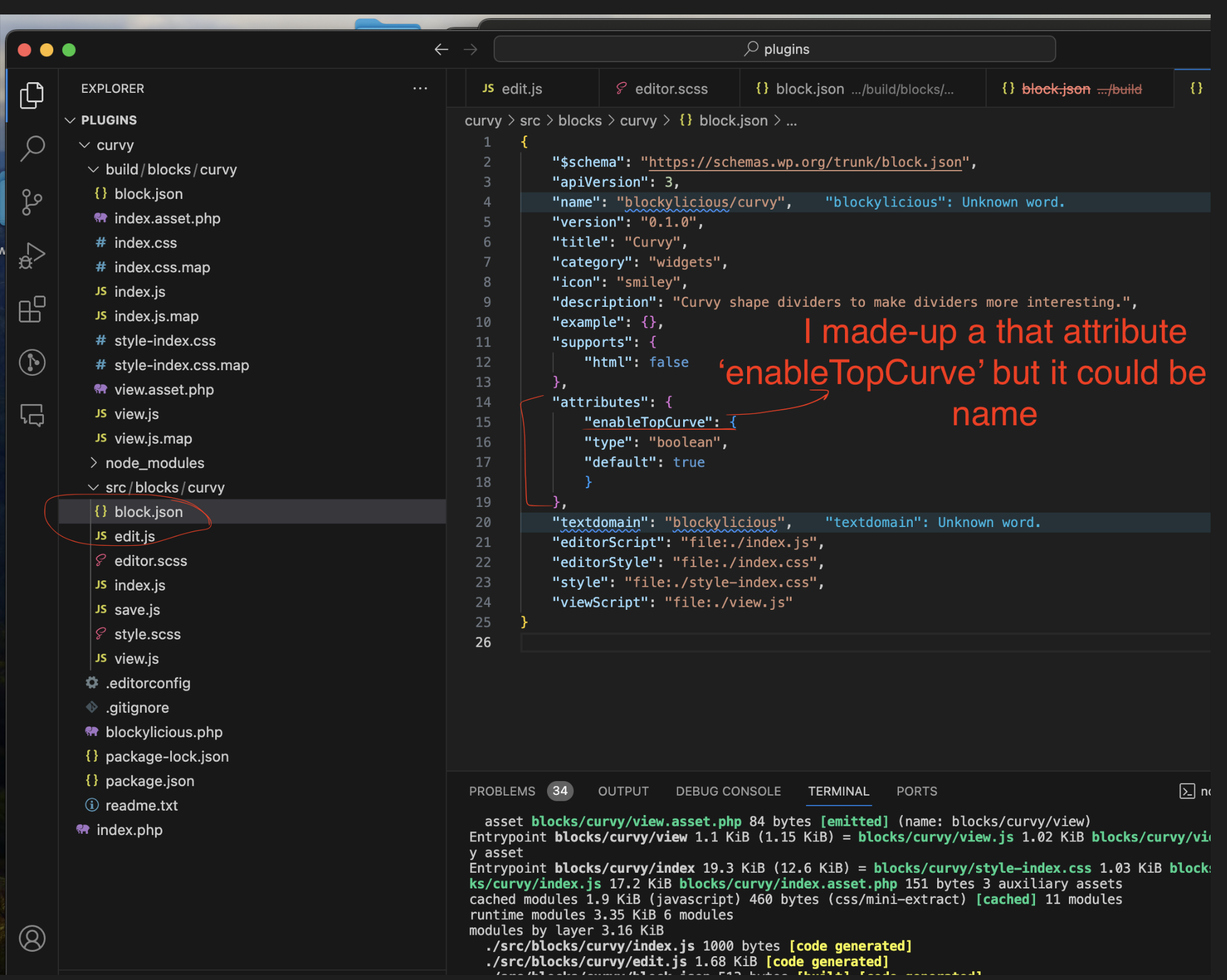
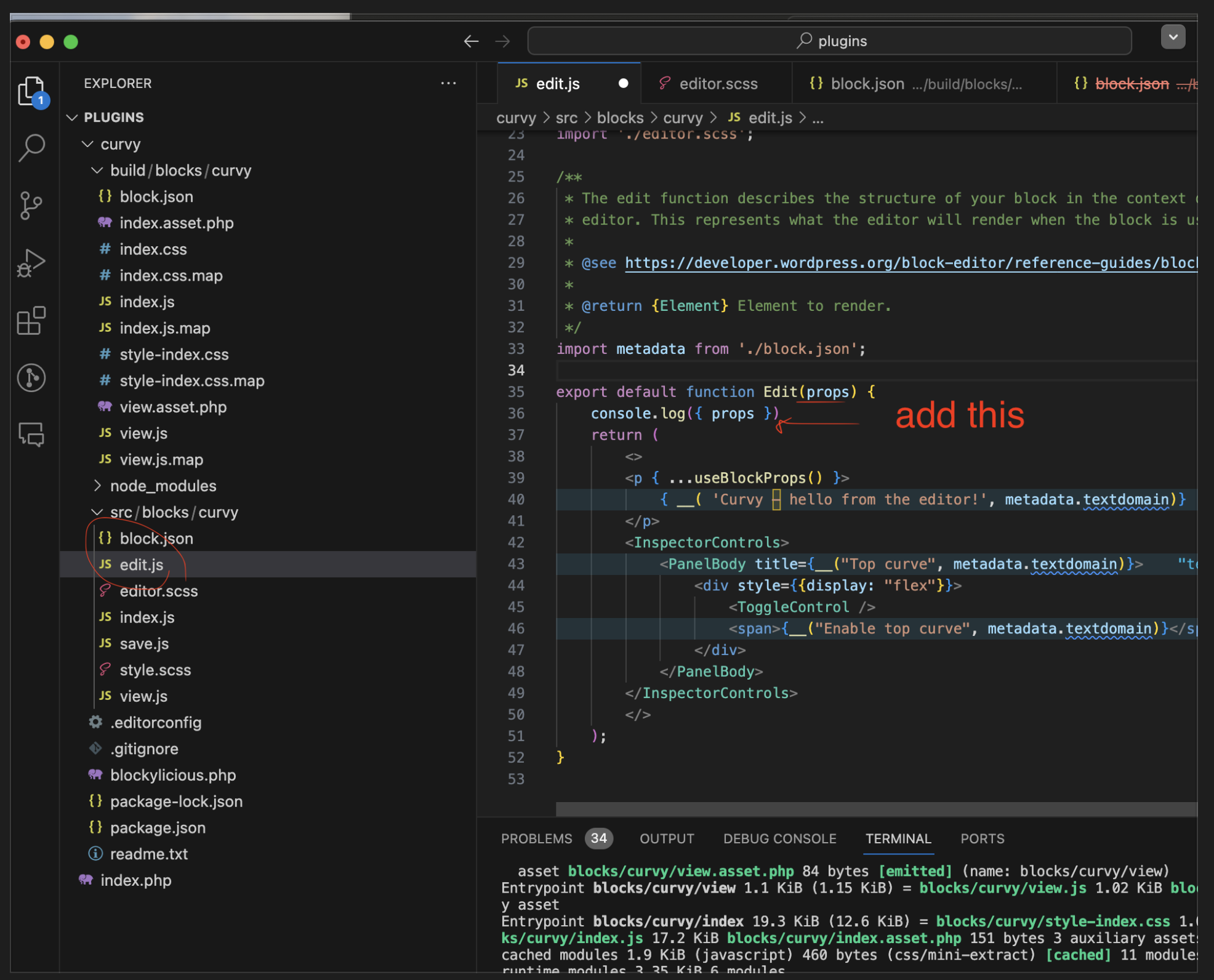
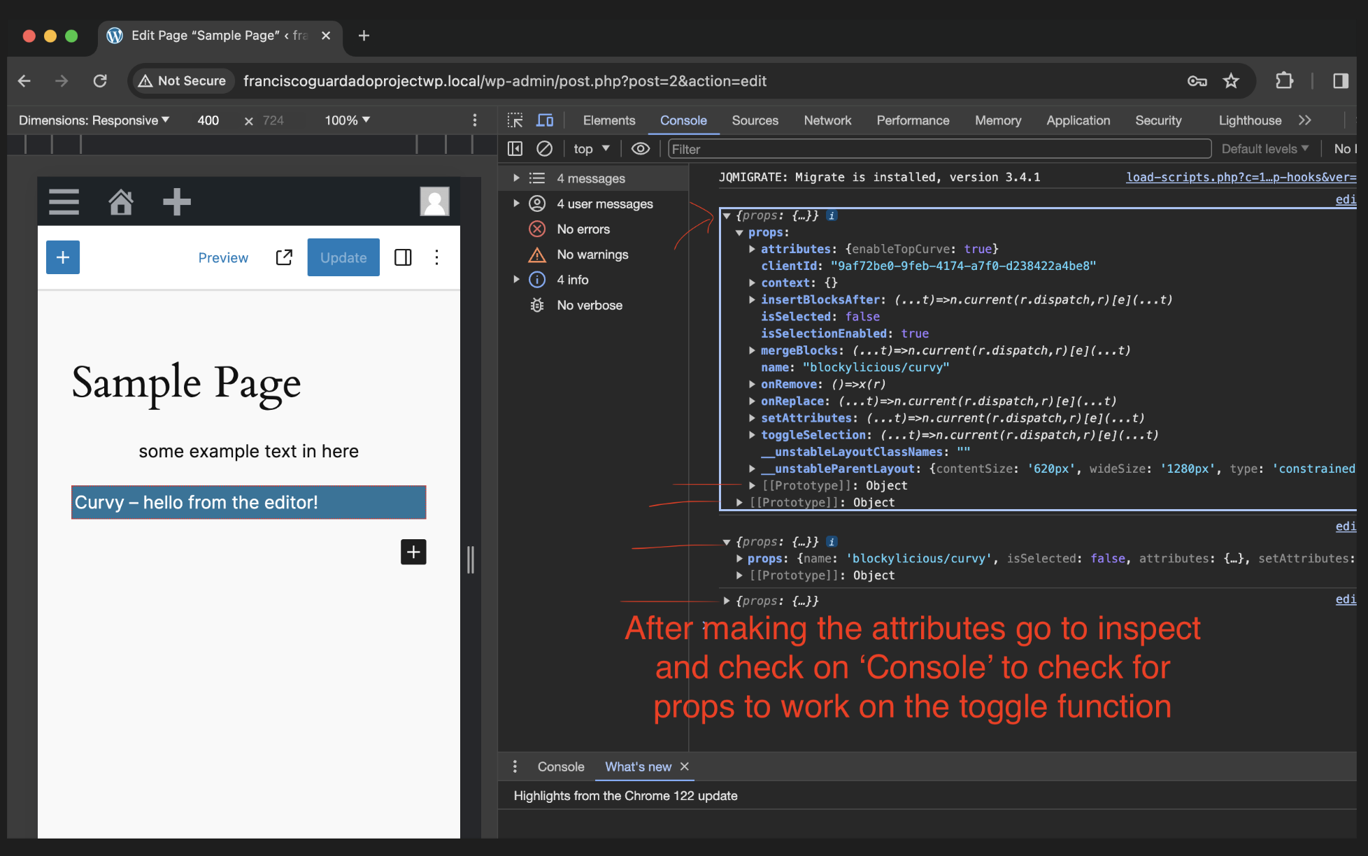
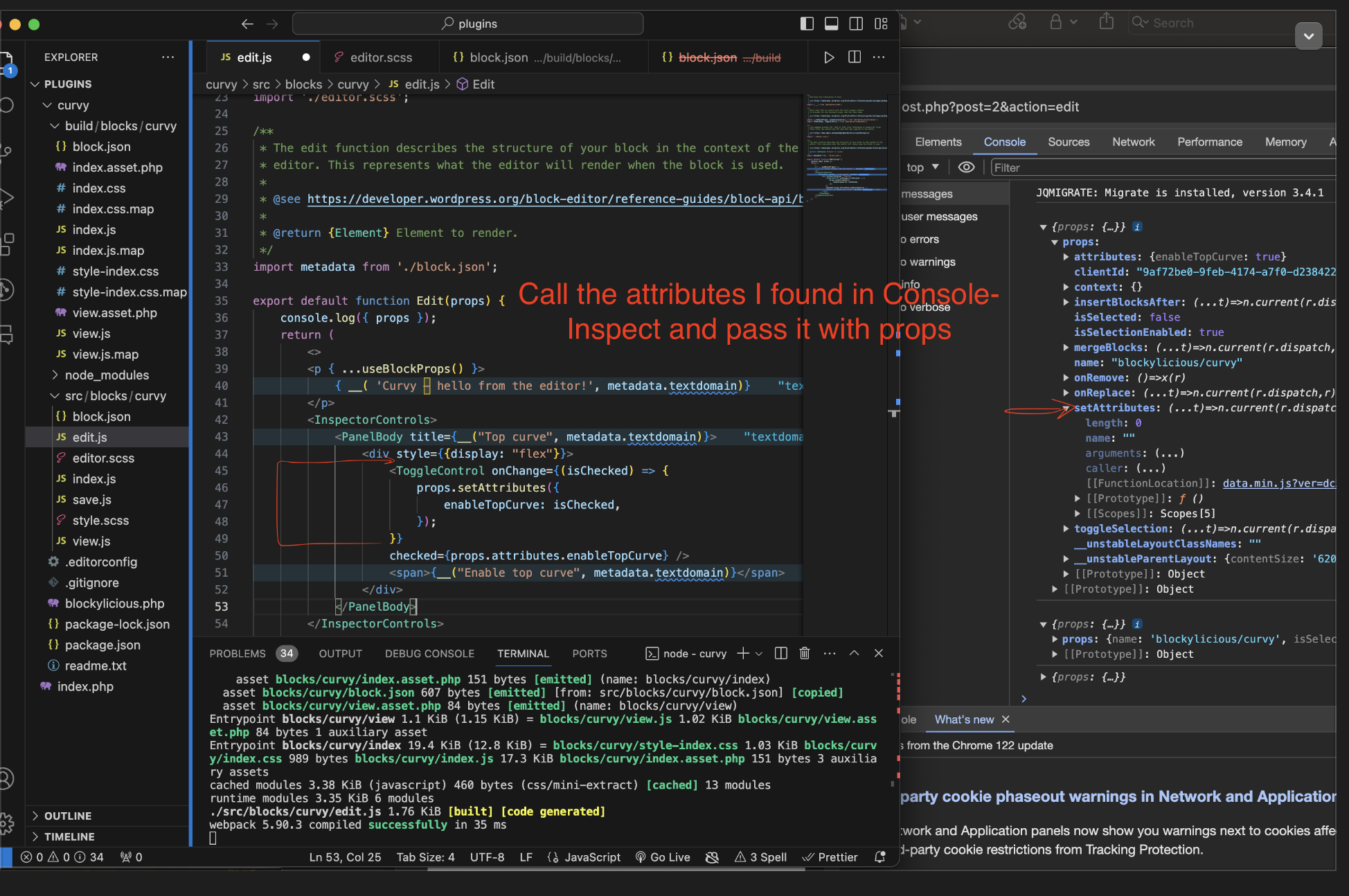
It’s important to use ‘Console Logs’ with INSPECT because as I make changes in the code, the props I enable will show on INSPECT the attributes I need to use in my code
===============================================================
SRC/BLOCKS/CURVY. > THEN MAKE A NEW FOLDER CALLED ‘COMPONENTS’
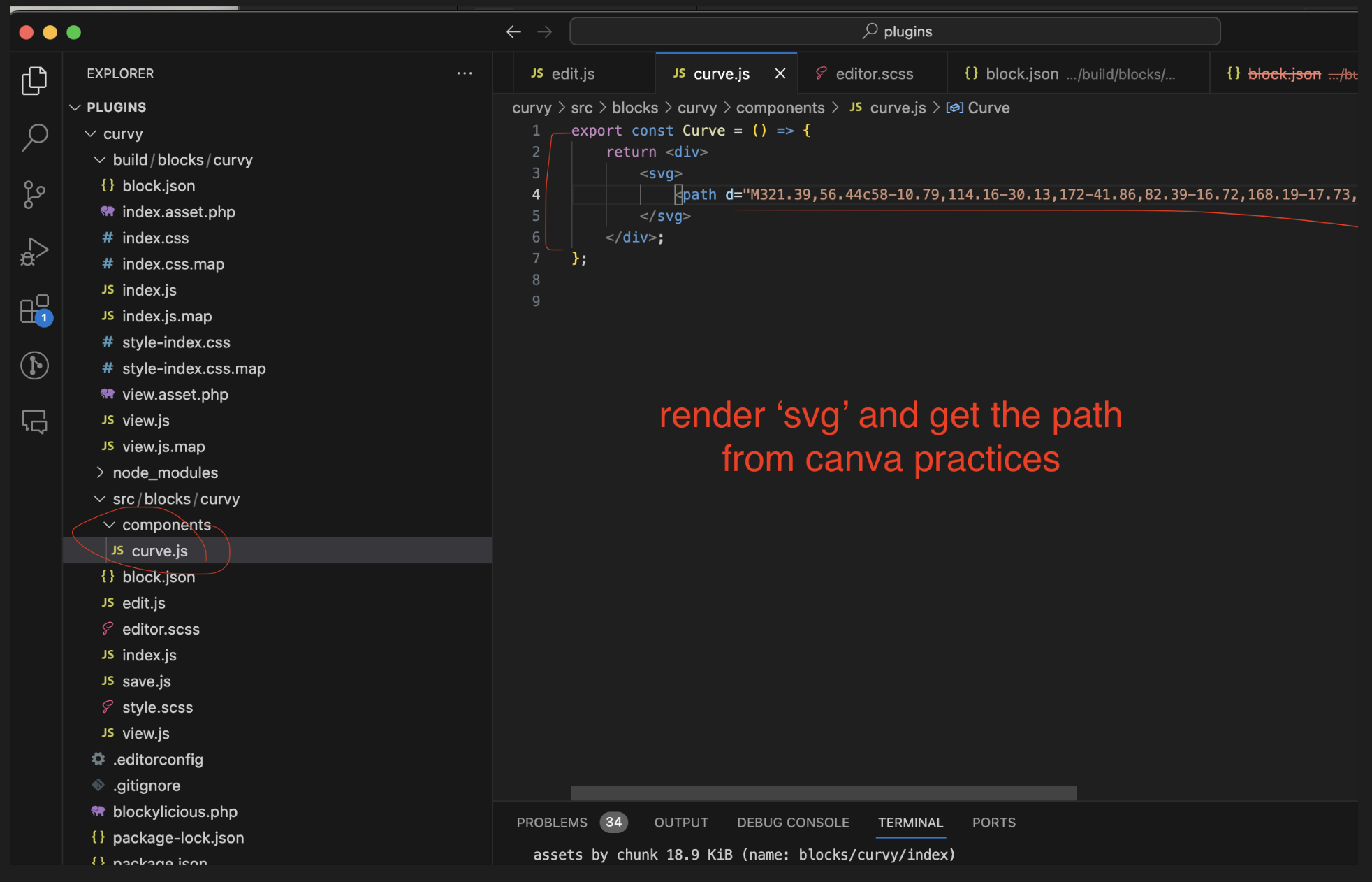
Components directory is responsible to for rendering our current sag
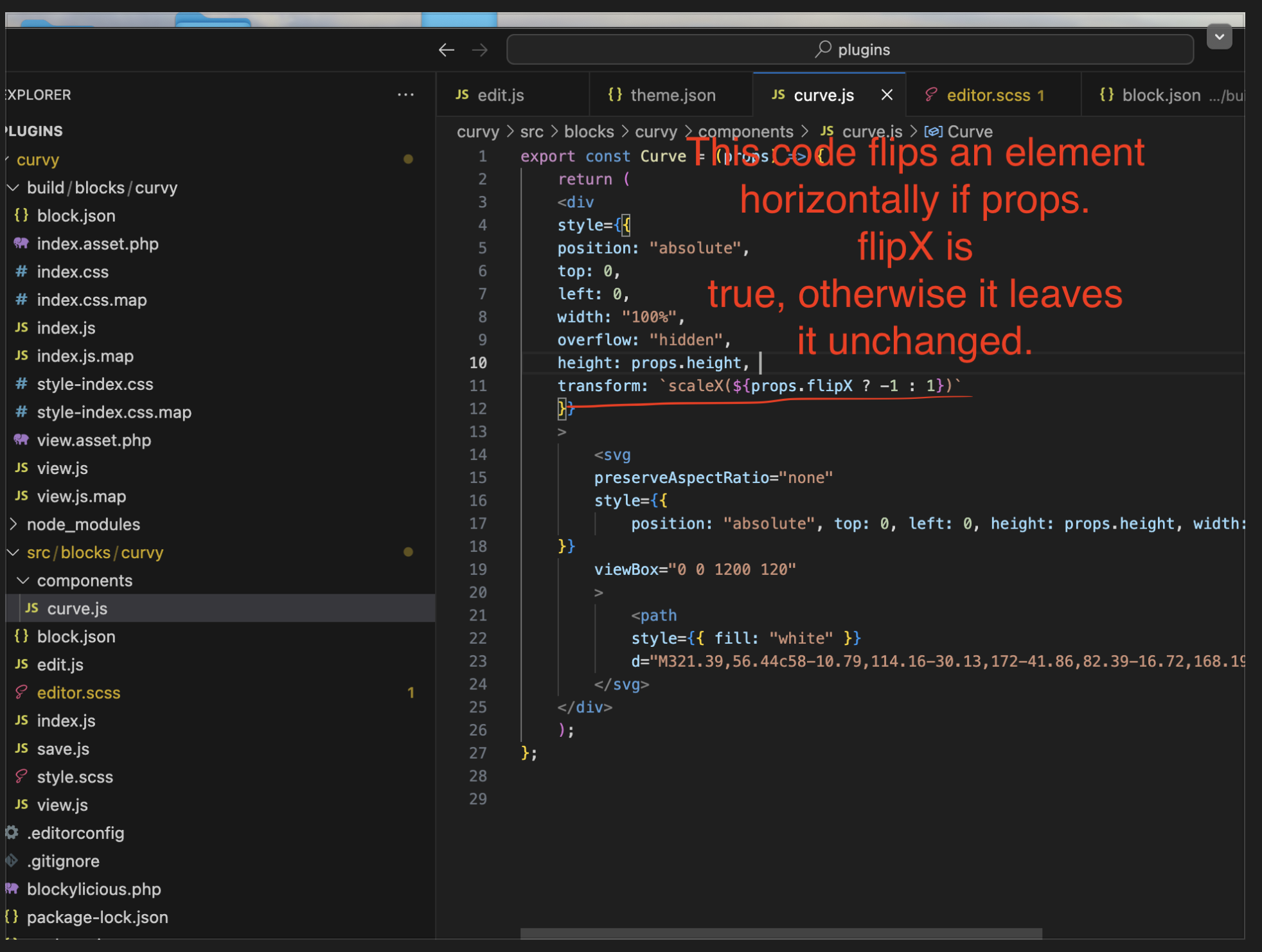
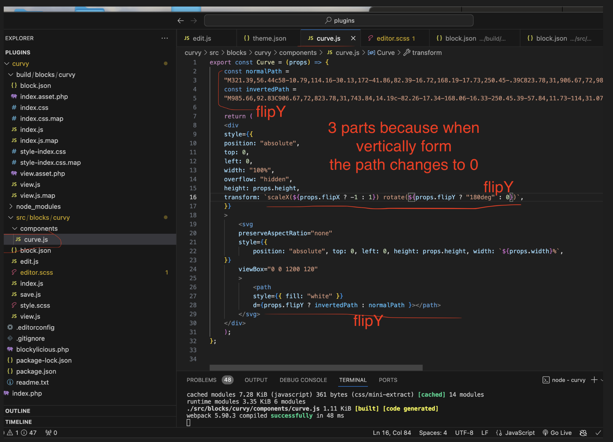
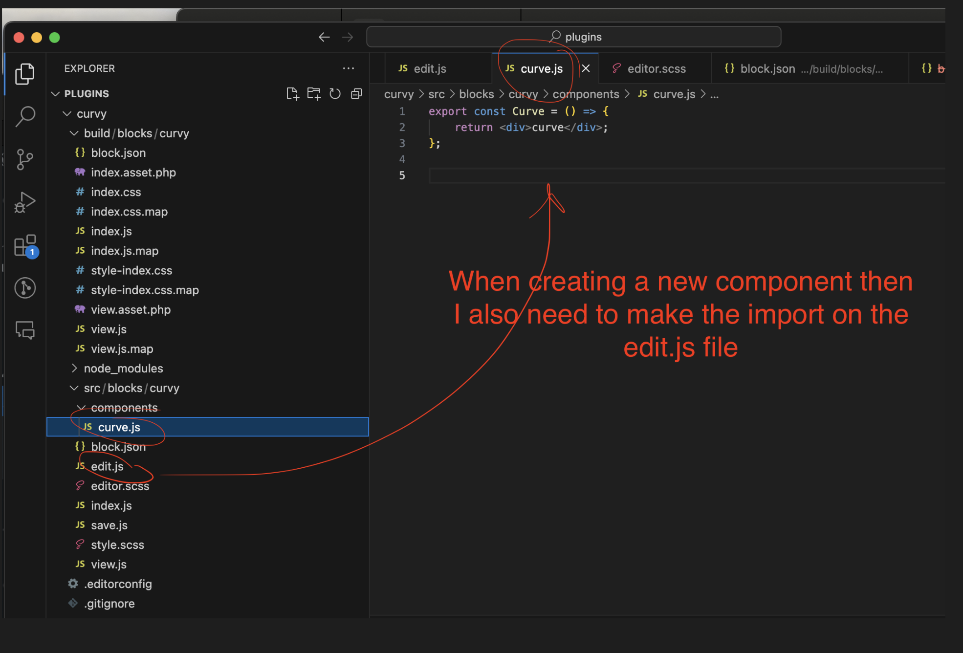
Components > CURVE.JS will export a react component
Components: They are functions that return some html mock-up
Components need to be with first character as Capital: example C
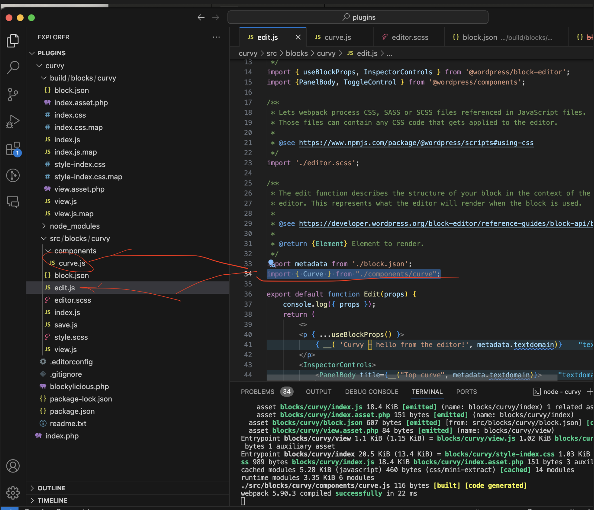
Then make the import to the Edit file
Note:
Edit:
import { Curve } from "./components/curve";
It is imported that way because it’s a name component
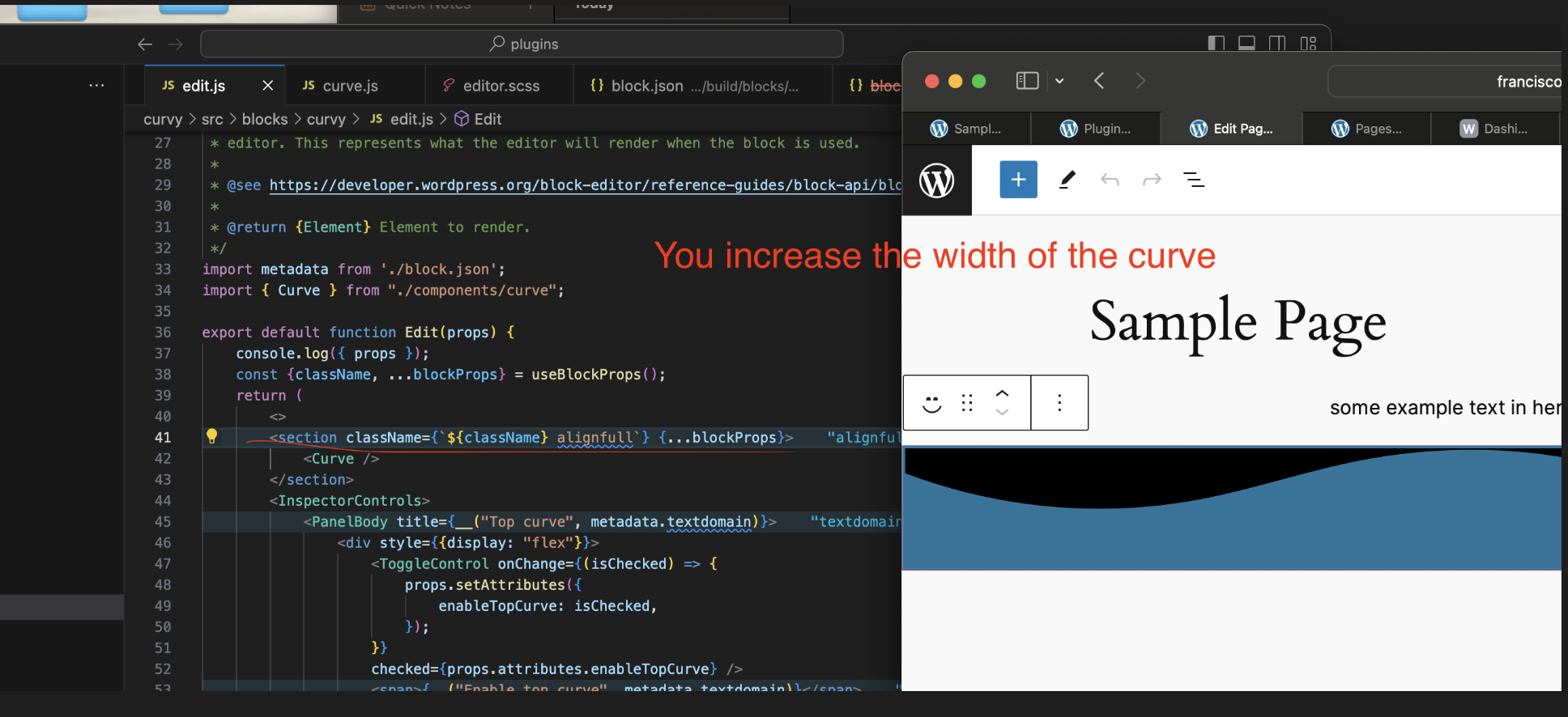
Remember, the less hard code the better. The point of the process is to render the SVG
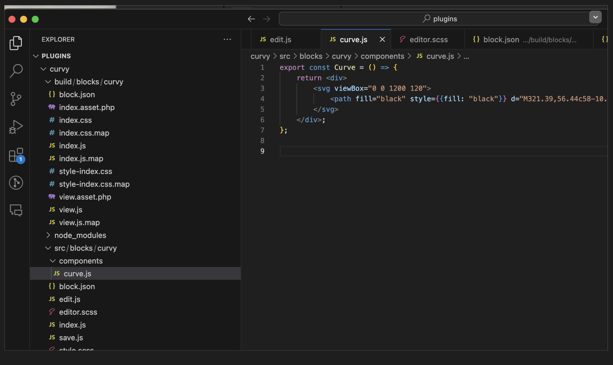
So, next you change the div by SVG tag, to make a path with a “d” attribute
To create an SVG
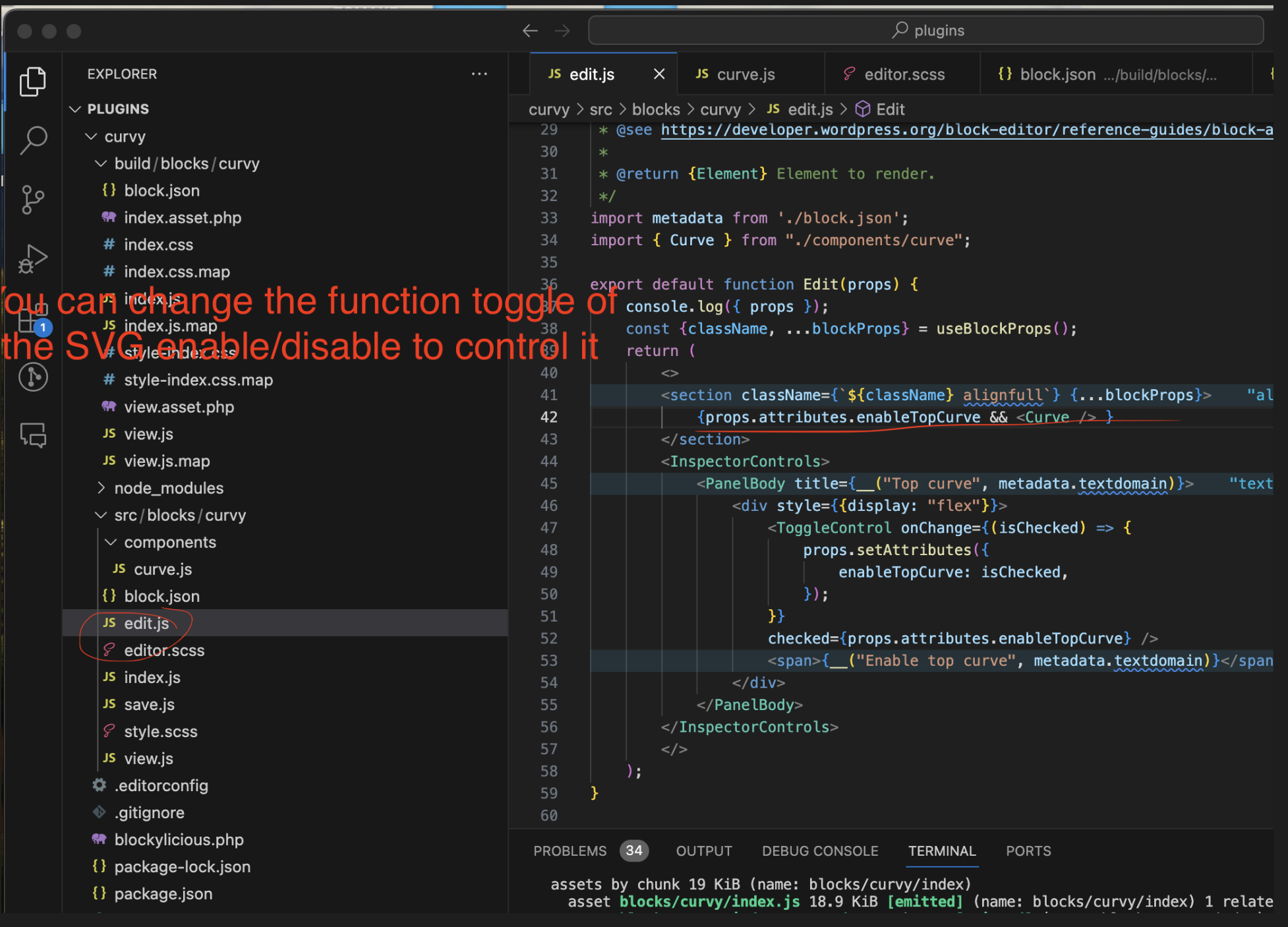
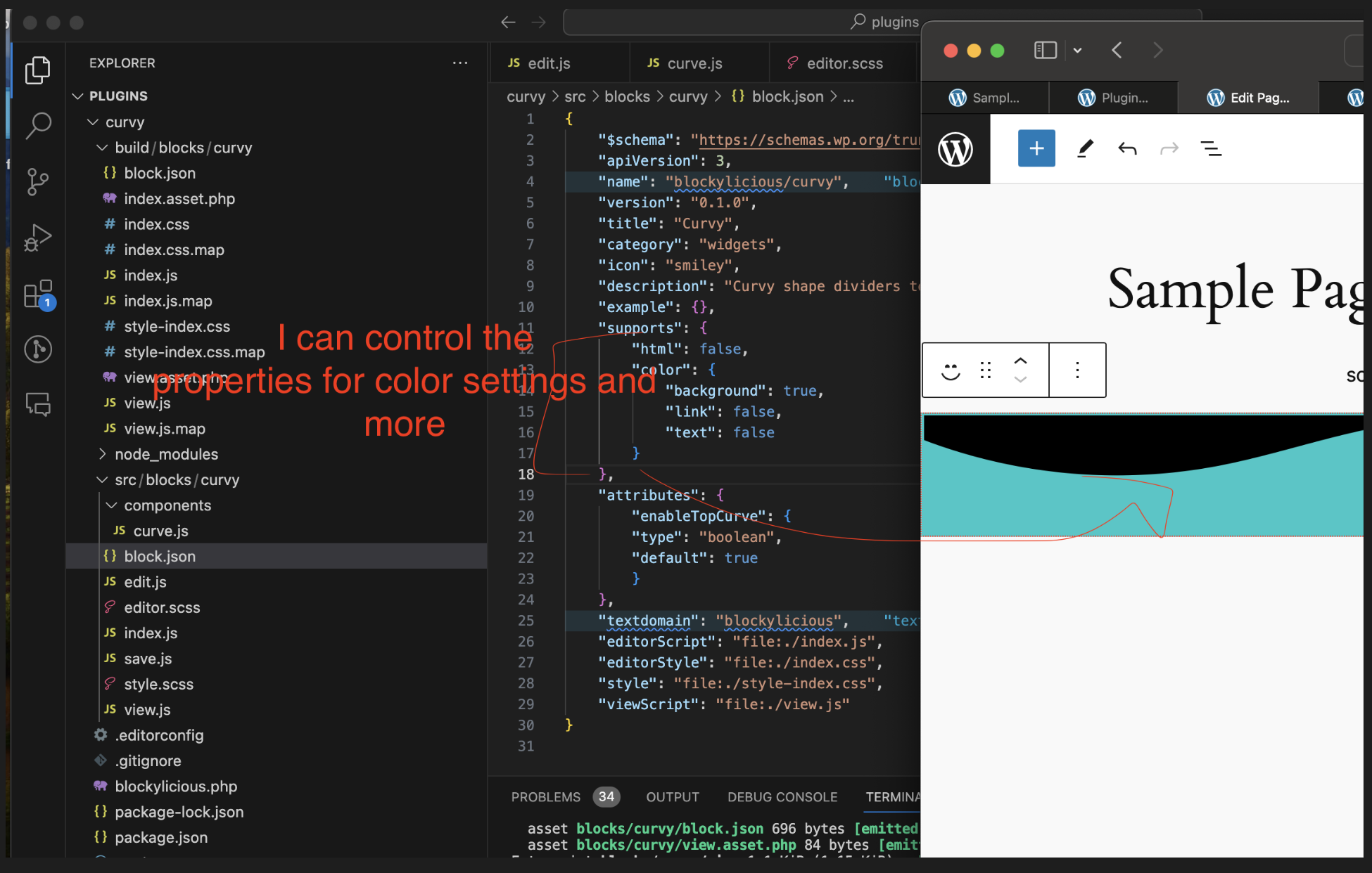
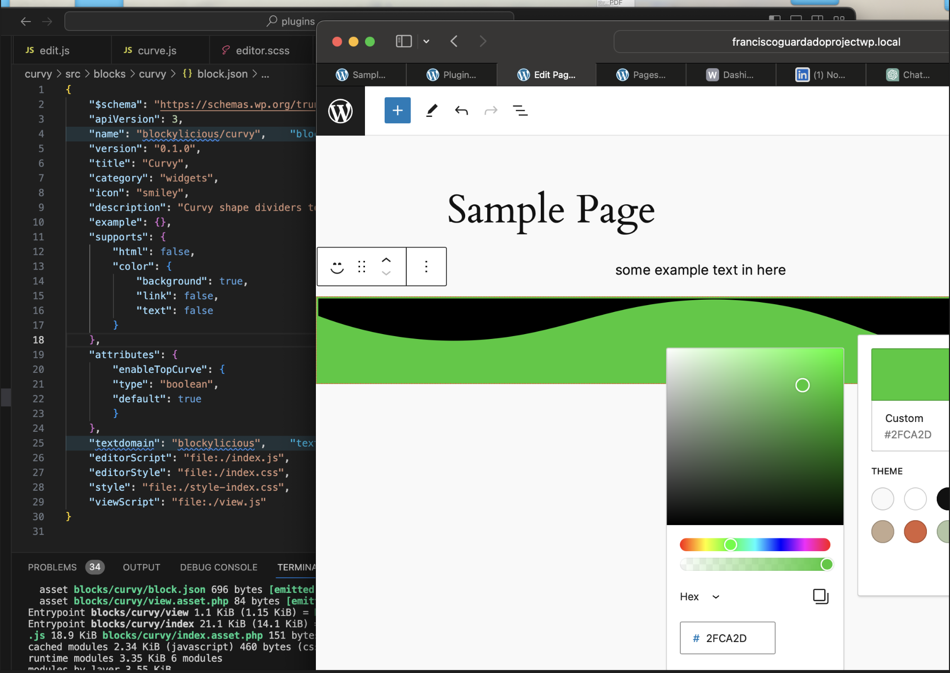
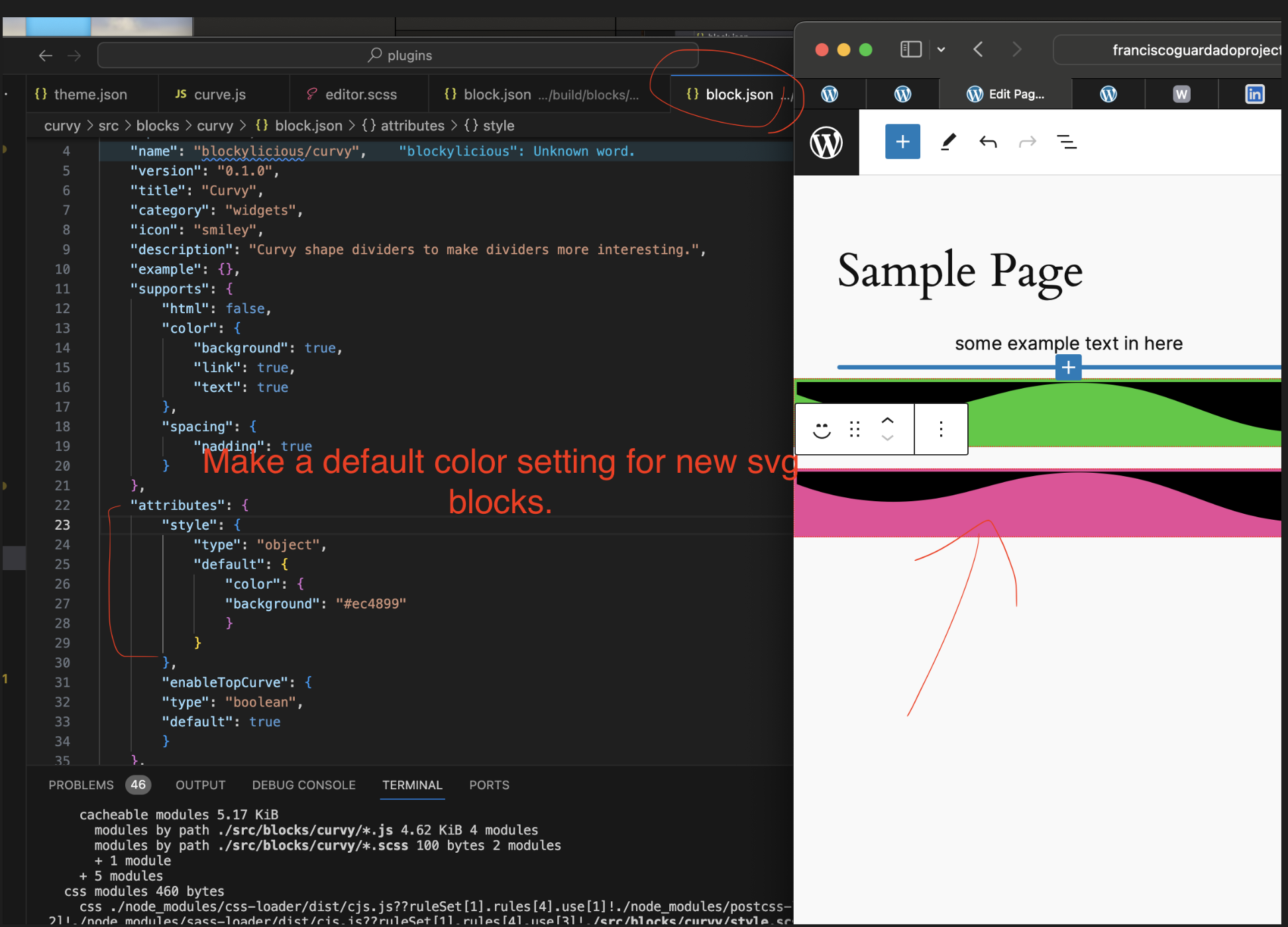
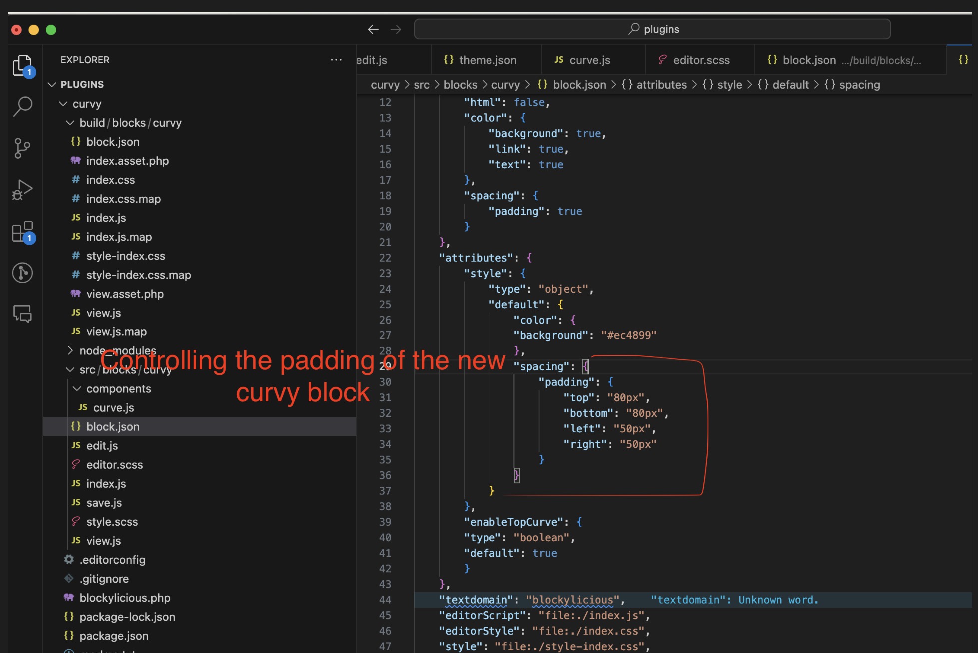
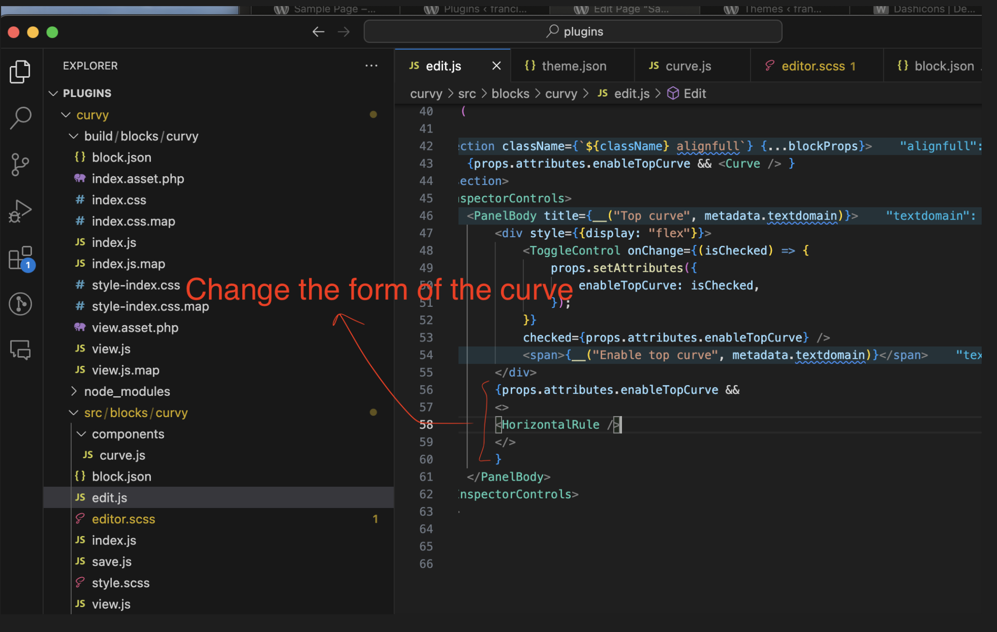
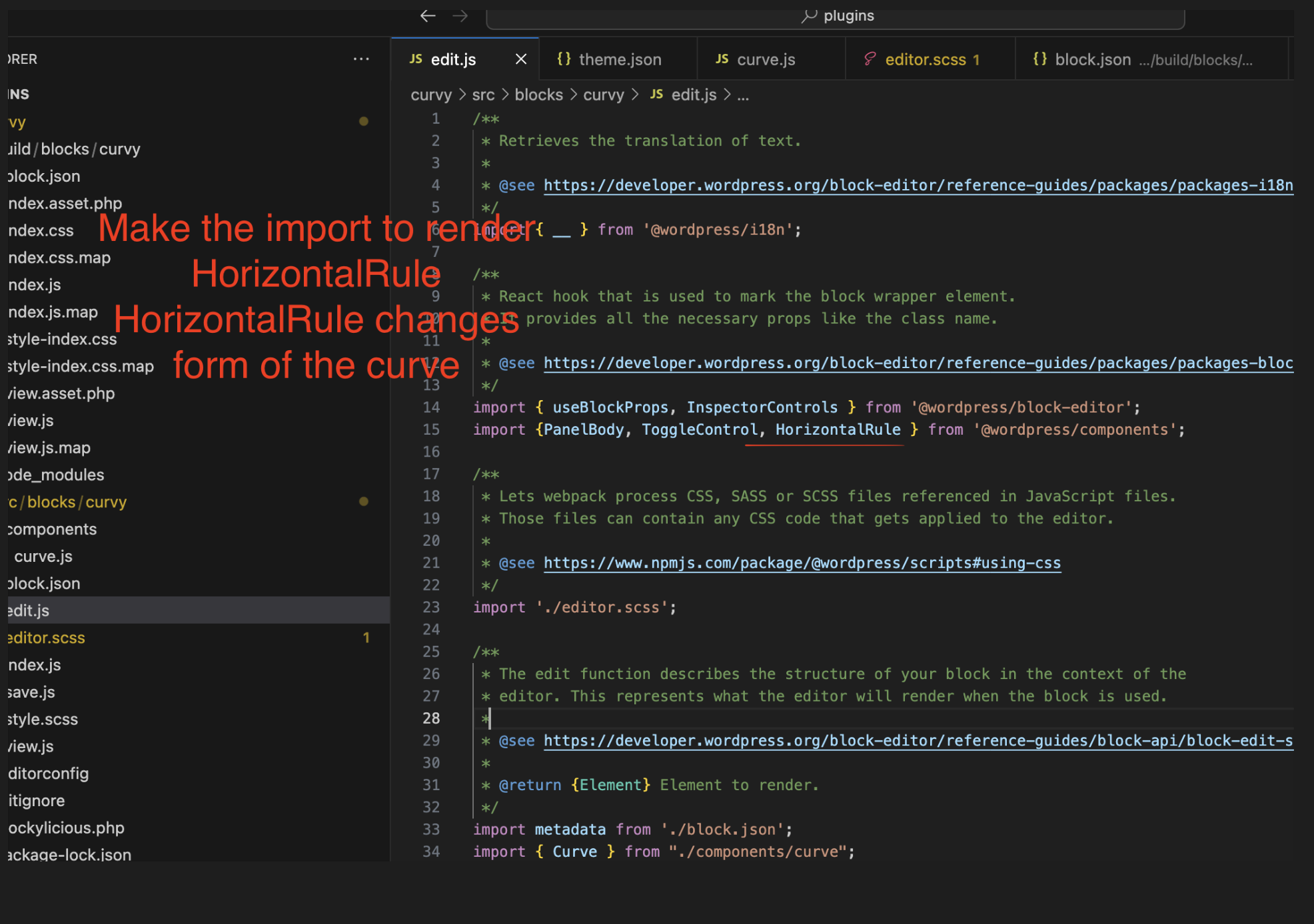
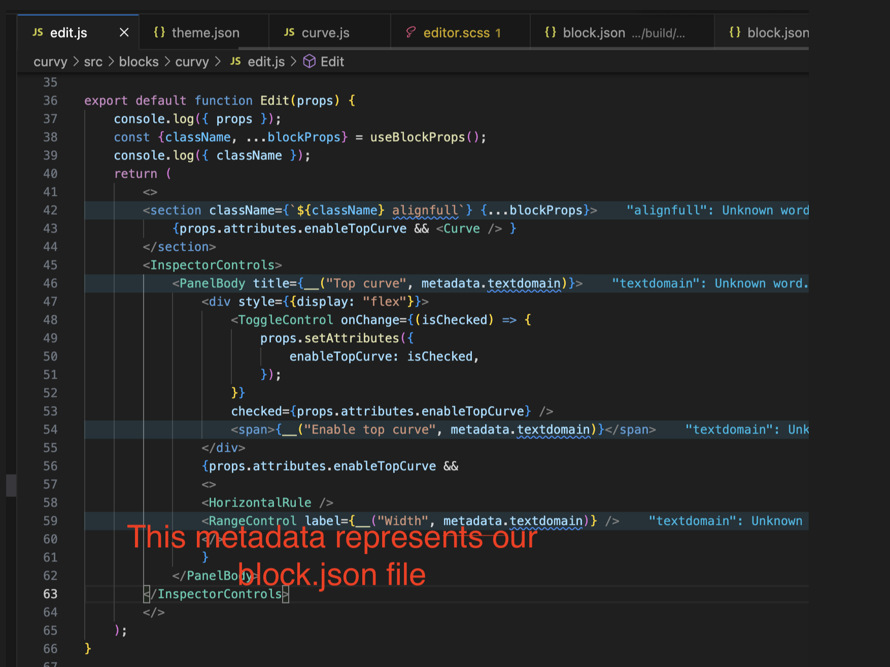
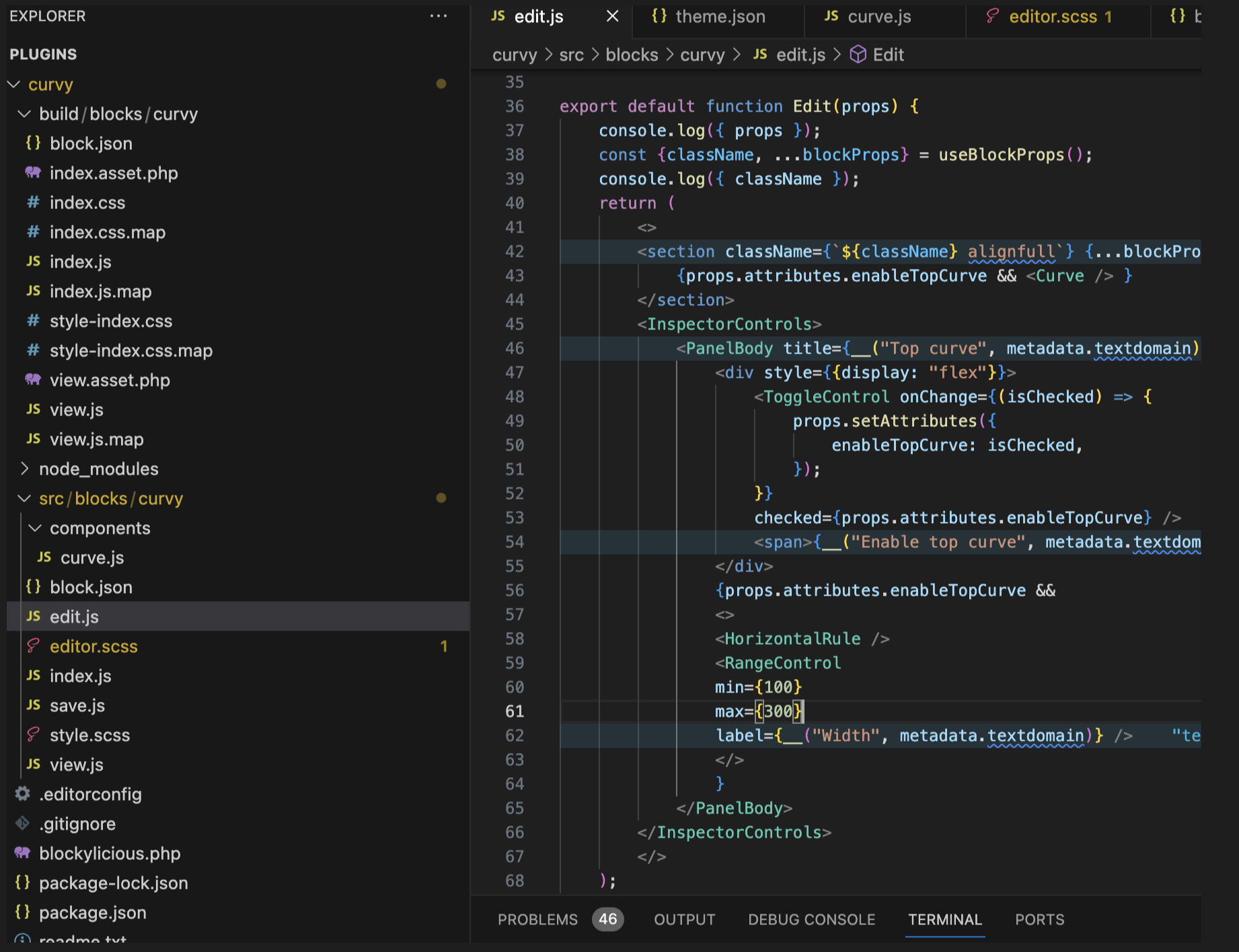
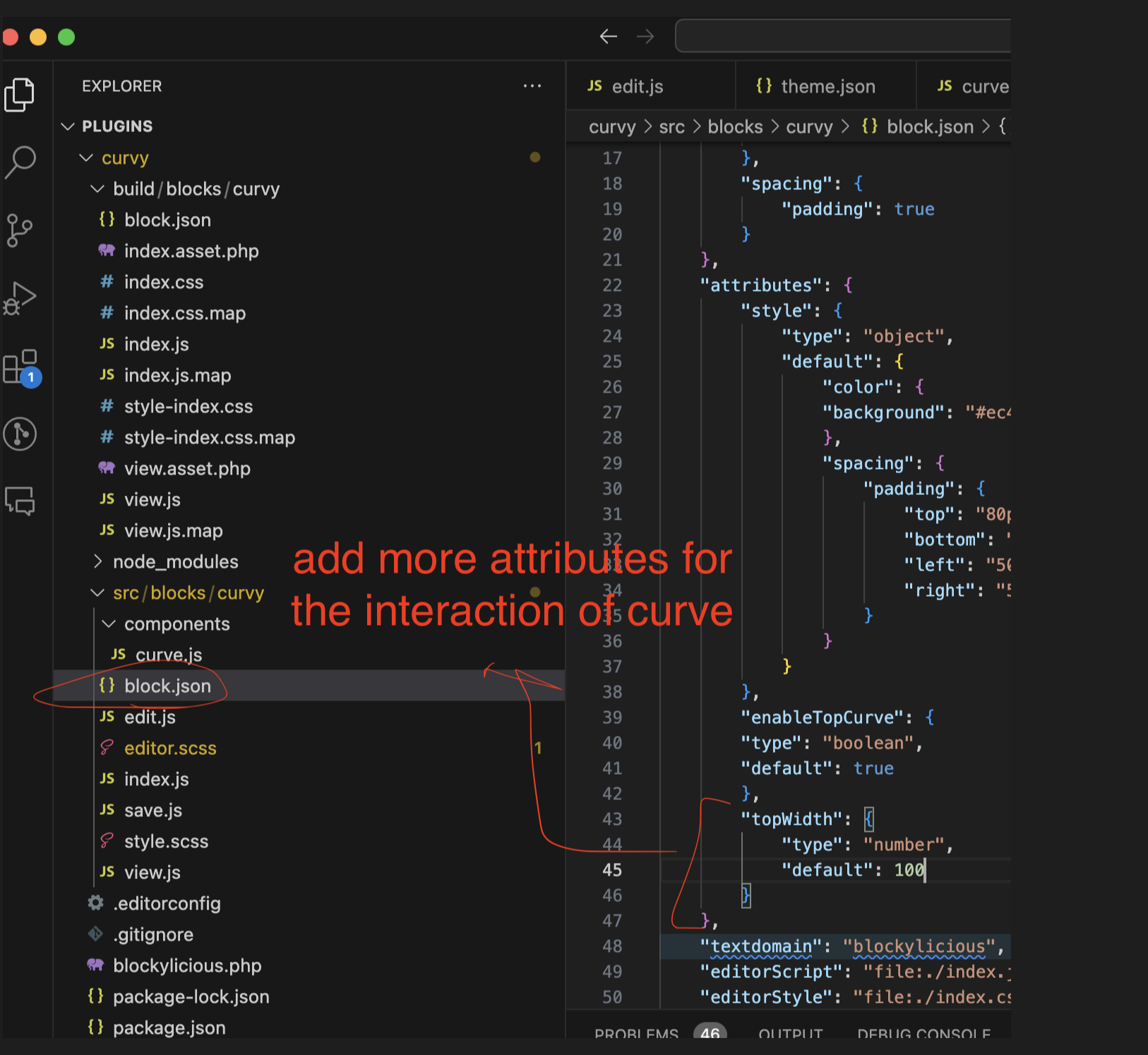
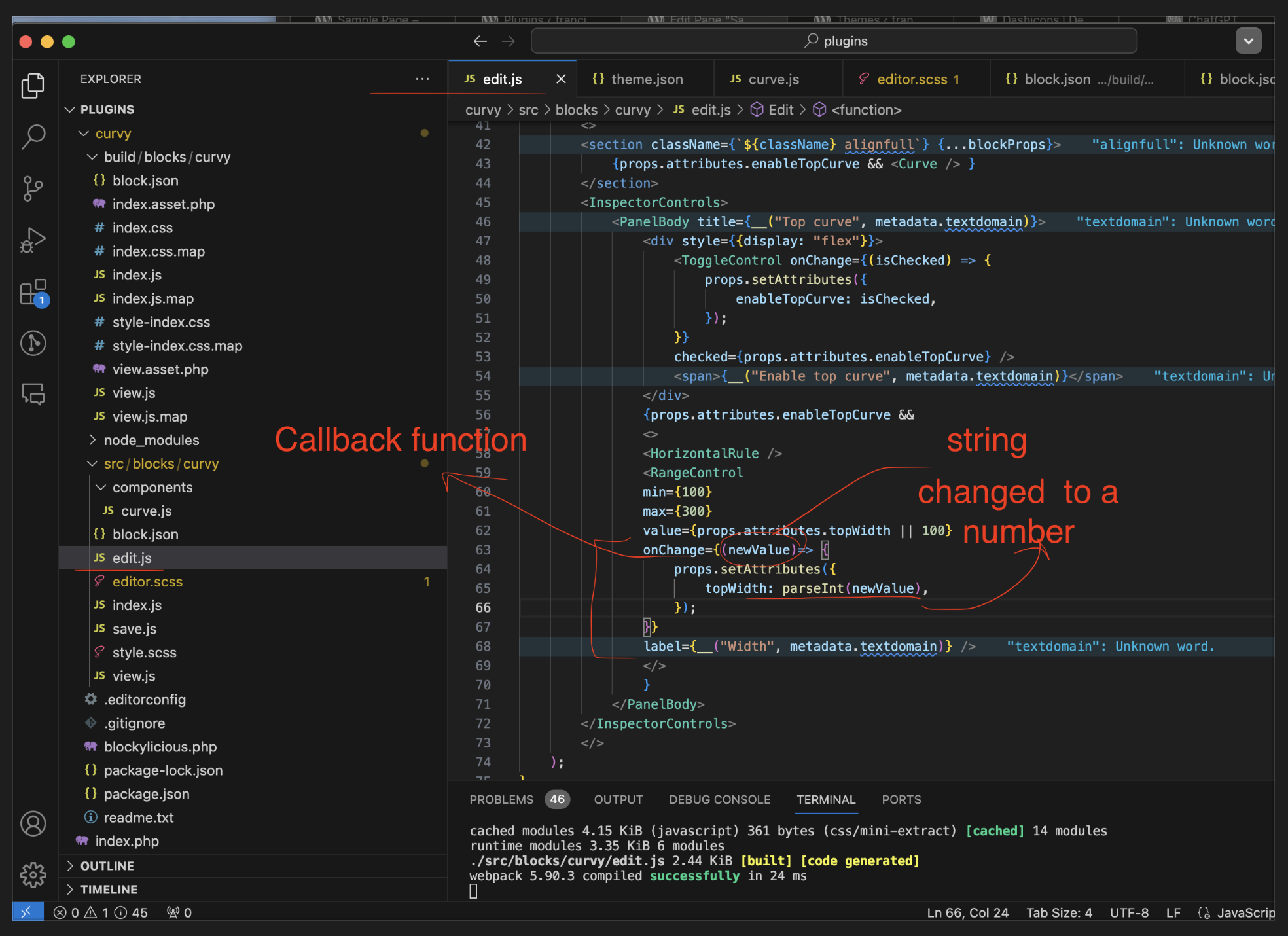
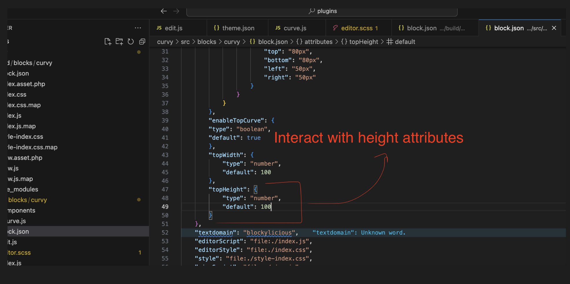
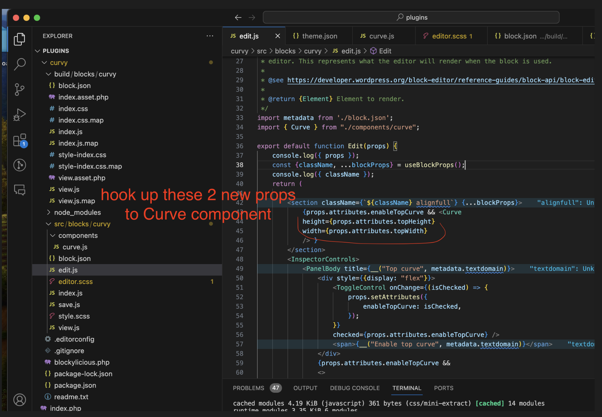
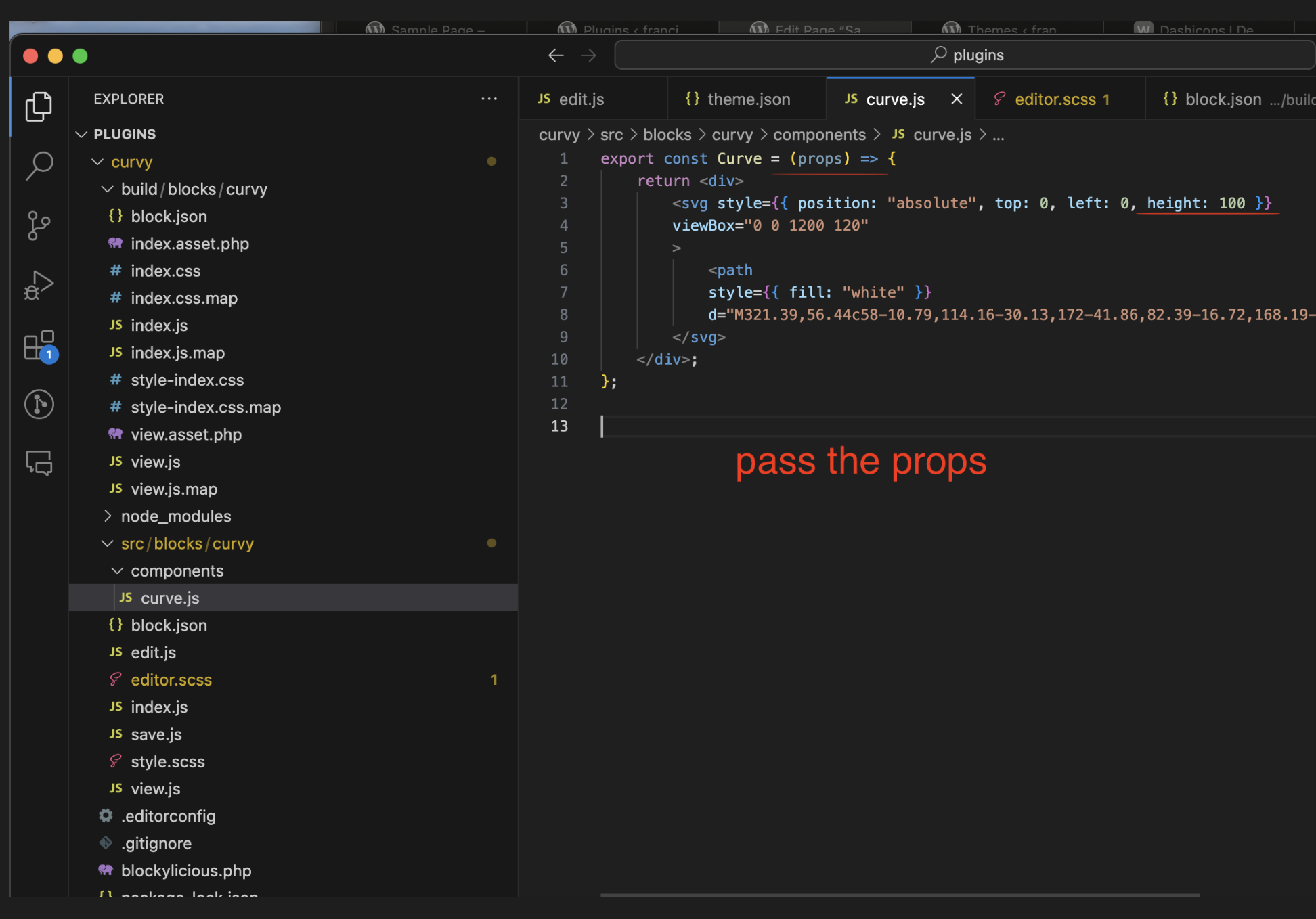
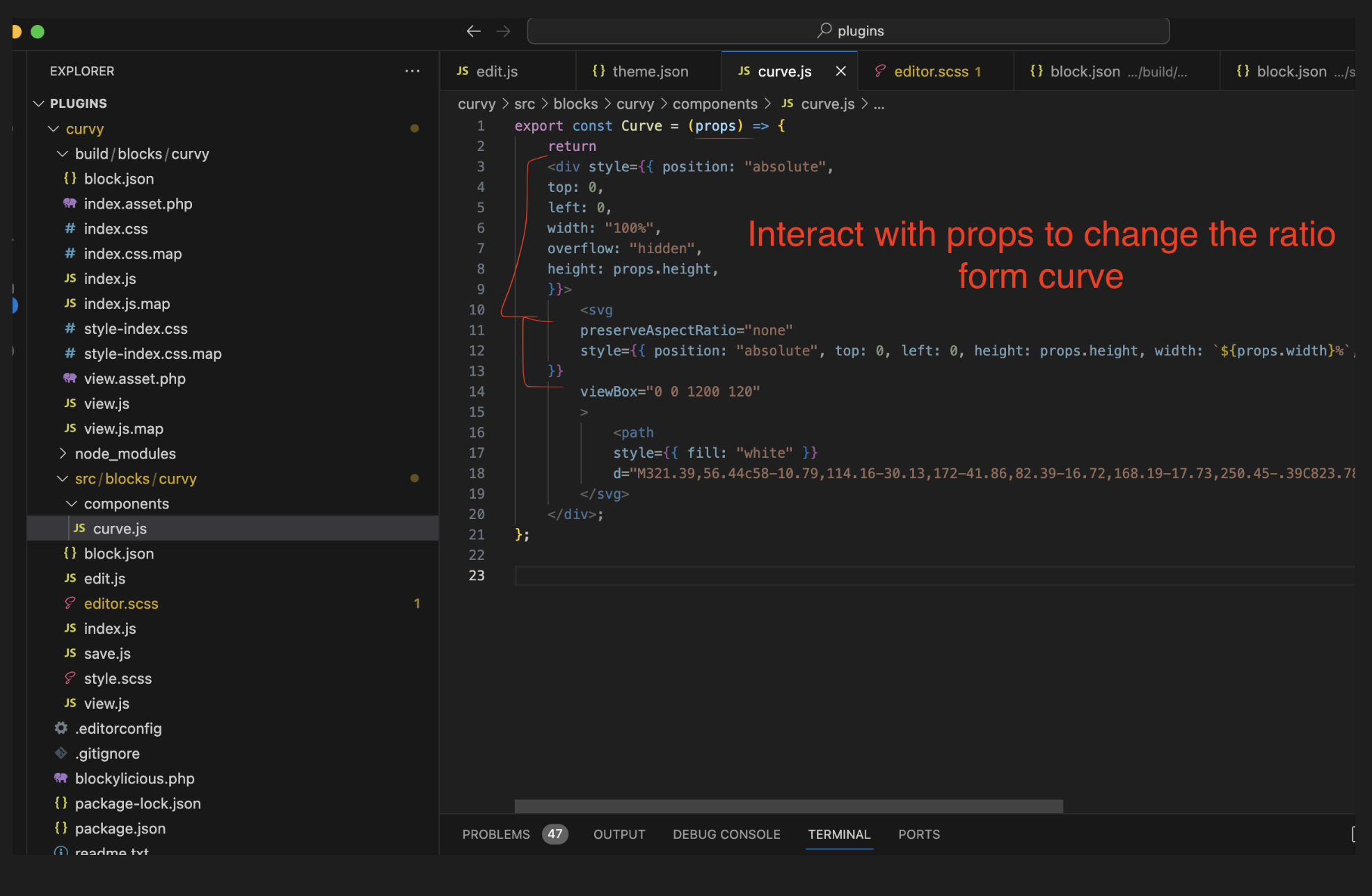
Important to work with props. For example the interaction of the toggle function we need to write code for the props on the components/CURVE.JS
